Empty states - Usage
Empty states are used to fill spaces when no content can be shown to the user, or is temporarily empty due to the nature of the feature.
Guidelines
Empty states are moments in the experience where there's no data or content to show — a chance to communicate with users that shouldn't be treated as an afterthought. They should clarify what the space is for, why it's empty, and what the user can do next. When designed thoughtfully, empty states become an essential part of a smooth experience, providing just enough context and guidance to help users stay productive.
Empty states can occur for different reasons. This component includes variants for the most common cases, from simple “no data” moments to error-related states that need more detailed guidance or troubleshooting. Using these ensures consistency and clarity across all empty and error screens in our marketplaces.
Use for
- Educational and onboarding messages (e.g. no favourites to show because user hasn't saved any favourite items)
- Error states
Don't use for
- Global system messaging (e.g., system maintenance coming up). Use the Alert instead.
- Feedback messaging (e.g., address saved to favourites). Use the Toast instead.
Types of empty states
No data empty states
These are the most common and recognisable types of empty states. Use them when there's no data to display, either because the user hasn't engaged with the feature yet or because their action returned no results. They explain what will appear once the space is populated with data and guide the user on what to do next. And they should reassure users that the absence of content is normal and temporary, not an error.
Use cases: First-time use, no data yet, no results when searching, etc.
Goal: Users understand what will be available on the page when data has been added or is available. They understand how to add data themselves.
✅ Dos:
- Be specific about what content will appear when data is available.
- Keep the message short and actionable so it is easy to scan and understand.
- Include a clear next step when possible. Use the available buttons or, alternatively, provide simple guidance to help users take action.
🚫 Don'ts:
- Don't combine multiple use cases in one state. Focus on one clear action.
- Don't reference other areas of the app. Be contextual.
- Don't lead the user into dead ends. If there are useful next steps, include them.
- Don't over-explain or use technical language. Keep it human and aligned with the product's voice and glossary.

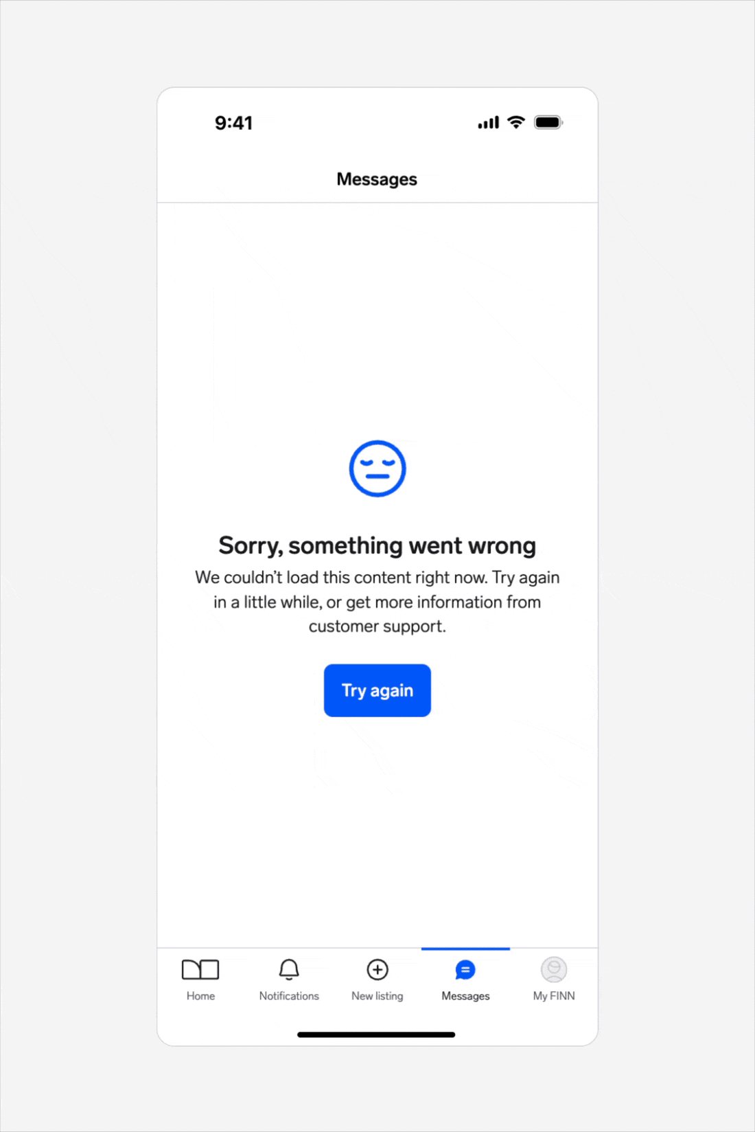
Error management empty states
Empty states can occur when there is data but it cannot be surfaced for some reason. A higher level of specificity is helpful here, with the aim that the user will be able to address the issue comfortably themselves.
Use cases: Permission issues, system issues, configuration required, etc.
Goal: Users understand the problem and if there are corrective actions available, know what action to take or have options to correct the issue.
✅ Dos:
- Consult with your team to explore what information is available (e.g., what kind of system errors can be experienced).
- Include clear corrective actions when possible. Use the available buttons or, alternatively, provide simple guidance to help users take action.
- When relevant, include a short reference to the error type or code to help users (and customer support) identify the issue more easily.
- Any visuals used should reflect the situation and be sensitive to what might feel serious to the user.
🚫 Don'ts:
- Don't include content that is about other areas of the app. Be contextual.
- If there are multiple things for the user to try, be sure to include a hierarchy so that it's clear which option would be the primary action.

For more detailed information about designing empty states, read Nielsen Norman group's Designing Empty States in Complex Applications: 3 Guidelines.
Visual guidelines
Empty states can include icons or illustrations to help communicate the message.
Icons
- Use icons from the ❖ WARP Icons library.
- Use icons at the default size of
64×64pxand in theIcon/Primarycolour token. - Don't use other icon sizes.
Illustrations
- Use imagery thoughtfully. Metaphors or objects may not translate across all cultures or languages. Illustrations are currently not provided by Warp, but can be added by product teams using their own assets. See available branded illustration libraries here.
- Use illustrations at the default size of
200×200px. - Don't use other illustration sizes or distort proportions.

Vend tagline
The “Part of Vend” tagline can be used in empty states to remind users that Vend is the platform behind their local brand. It helps reinforce trust and awareness that the experience is part of a larger Vend ecosystem.
Use the tagline in empty states where the message refers to a functionality or service delivered by Vend (e.g., login, or account setup).
See the Vend Endorsement guidelines for more information.

Content guidelines
- Keep empty state messages clear, purposeful, and action-oriented.
- When using the predefined variants, use the microcopy available to maintain consistency across our apps.
- If a predefined variant doesn't fit your use case, you can create your own message.
Visit Astro for guidance and best practices to ensure clear and consistent messages in empty states.
Custom state
If none of the existing variants fit your use case, create a custom version using the Custom state template.
Use the available properties in the component (see Anatomy) and follow the Content guidelines to keep tone, structure, and messaging consistent with the system.
When creating a custom empty state:
- Keep layout and spacing aligned with existing variants.
- Use system tokens for colour, typography, and iconography.
These foundations should work out of the box but, if you need further guidance, reach out to the Warp team on Slack (#warp-design-system).
Behavior
The only required element in the Empty state component is the title, which uses the T3 heading token. All other elements are optional and should be included based on the use case.
The component has a 420px max width to ensure the message remains readable and doesn't stretch too wide on larger screens.
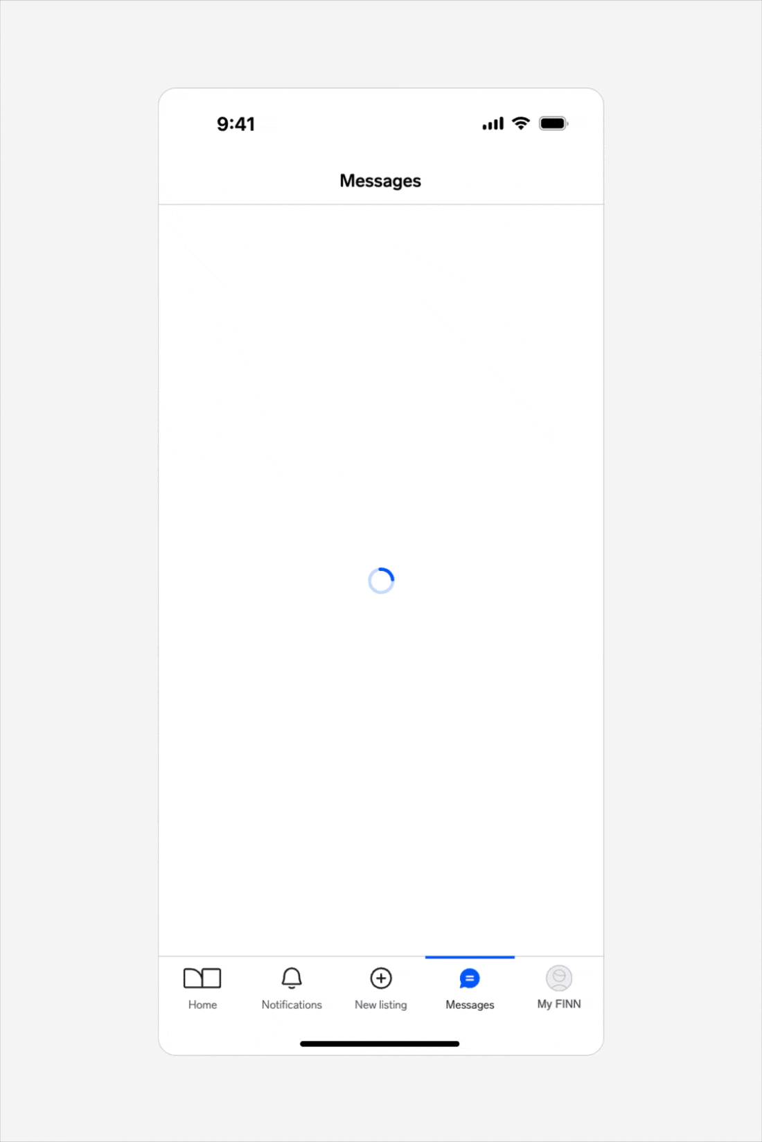
Loading behaviour
A loading state may briefly appear before the empty state is shown. When loading completes, the content fades in to replace the progress indicator.
Interaction
Consider adding an action button or relevant links to guide and help users proceed to the next step in resolving the case.
Reload interaction
When interacting with a button to reload data, show a loading spinner after the user taps on the button. This indicates that the system is processing the request.
- If reload succeeds, replace the empty state with the intended content.
- If it fails, replace the spinner with a button so the user can retry the action.
Placement
Empty states can appear either as the main element on a screen or within a container (e.g., modal), depending on the context and user flow. Choose the placement that best matches how and where users encounter the empty state.
Main element:
The empty state replaces the primary content area of the page. Global navigation elements such as headers, footers, or bottom menus should remain visible so users can continue browsing.
Always display the empty state close to where the missing content would normally appear, so the context remains clear to the user.

Example showing an empty state centered in the main content area of an app screen prompting the user to login, with navigation elements still visible for continued browsing.

Example showing an empty state centered in the main content area of the search results page on desktop web, with navigation elements and filters still visible for continued browsing.
In-container:
When used within a container, such as a modal or a section, the empty state should align with the layout and hierarchy of that container. Keep spacing consistent with surrounding content.

Example showing an empty state displayed within a modal, aligned with the container layout.
Questions?
Feel free to ask any questions on usage in the Warp DS Slack channel: #warp-design-system