
Alert - Overview
Alerts show high-signal messages meant to be noticed by or prompt users. An alert sits inline in the page, carries a status colour and icon, and stays visible until the situation it describes is resolved.
See also Snackbar, Box, Callout, and Modal.
Examples
General
An alert communicates the status of something the user is doing or looking at. It appears in the flow of the page, close to what it refers to, and it does not disappear on its own. That makes it the right choice for messages that must survive scrolling, re-reading, and screenshotting — validation summaries, service disruptions, payment problems, confirmations that matter.
Three properties define the component:
- Contextual: the alert belongs next to the content it describes, not in a global corner of the screen.
- Persistent: it stays until the underlying condition changes. Alerts have no auto-dismiss and, in Warp, no built-in close button.
- Status-carrying: the variant is a statement about what happened, not a styling choice.
Alert comes in four types — Info, Warning, Negative, and Positive. Pick the one that matches the severity of the situation. On web and Android the type defaults to info; on iOS the style is required. Always set it explicitly rather than relying on the default, so the severity is a decision rather than an accident.
Content is flexible. On web, anything can go inside the alert: a single sentence, a heading with a description, a list of validation errors, a link. On iOS and Android the component provides structured slots for a title, body, link, and up to two buttons. See the framework pages for exact APIs.
Type names per platform
The four types are the same across platforms, but the names differ. Use this mapping when moving a design between platforms:
| Figma | Web (Elements) | iOS | Android |
|---|---|---|---|
| Information | info | .info | WarpAlertType.Info |
| Warning | warning | .warning | WarpAlertType.Warning |
| Negative | negative | .critical | WarpAlertType.Critical |
| Positive | positive | .success | WarpAlertType.Positive |
Variants
Information
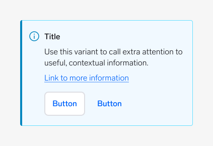
Use the information variant to call extra attention to useful, contextual information. Nothing is wrong and nothing has succeeded — the user simply needs to know something before they continue.
Examples: "This ad expires in three days", "Shipping is calculated at checkout", "You are viewing an archived version".
If the information is permanent page content rather than a response to context, use a Box with the info variant instead.
Warning
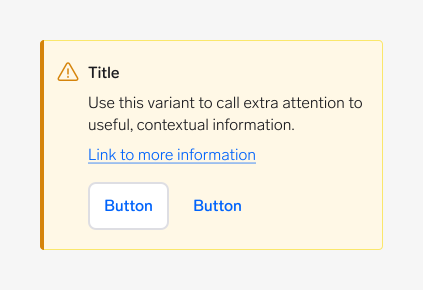
Use the warning variant when something needs the user's attention but is not yet broken. The user can still continue, but there is a consequence if they do nothing.
Examples: "Your card expires next month", "Changes are not saved", "Connection is unstable".
Warning is the variant most often misused. If the user cannot act on it, it is information. If the action already failed, it is negative.
Negative
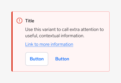
Use the negative variant for errors and severe problems that require attention. Something failed, is unavailable, or blocks the user from finishing their task.
Examples: "Payment declined", "We could not publish your ad", "Three fields need your attention".
Always say what went wrong and what the user can do about it. A negative alert with no way forward is a dead end.
Positive
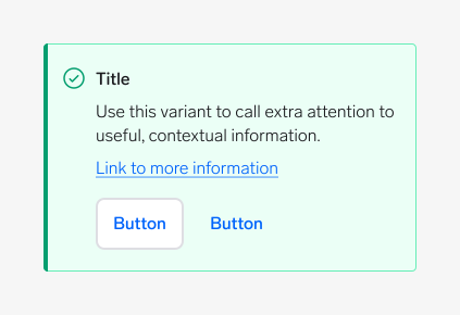
Use the positive variant to confirm that an action succeeded or a task completed, when the confirmation is important enough to stay on the page.
Examples: "Your ad is published", "Payment received", "Profile verified".
For a short, low-stakes confirmation that does not need to persist — "Copied", "Saved" — use a Snackbar instead.
Anatomy
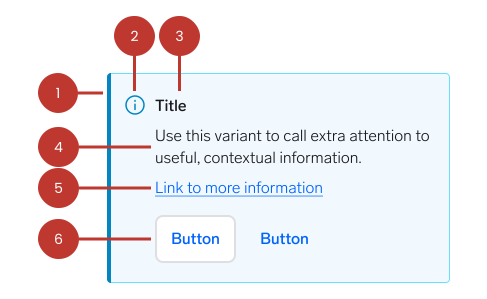
- Container: The surface that holds the content. Its background, border, and corner radius come from the variant.
- Status icon: Reinforces the variant. It is set by the component — you do not choose it. Because it is paired with colour, it also carries the status to users who cannot distinguish the surface colours.
- Title (optional): A short summary of what happened. On web you supply your own heading element; on iOS and Android the component has a title slot.
- Body text: The message. This is the only required content.
- Link (optional): Takes the user to more information elsewhere.
- Buttons (optional): Up to two actions that resolve the situation described by the alert. Available on iOS and Android as structured slots; on web you place buttons inside the alert yourself.
Questions?
Feel free to ask any questions on usage in the Warp DS Slack channel: #warp-design-system