
Callout - Overview
Callouts are snippets of information, drawing attention to important content. A callout is anchored to something on screen — a button, a field, a piece of copy — and points at it with an arrow.
See also Tooltip, Popover, Alert, and Box.
Examples
General
A callout is a small speech bubble that names one thing. It carries a short message, an arrow pointing at the element the message is about, and optionally a close button. It has no icon, no heading, no status colour and no action button — everything it has to say fits in a sentence.
Callout is not a status component. It does not turn red for an error or green for success, and it is not tied to something that just happened. Its job is to draw the eye to an element that is already on screen and explain why that element matters.
Callout is a manually controlled component on every platform: it is hidden until you show it, and it stays visible until you hide it. It has no timer, and closing it is your application's job — see Behaviour in Usage.
Naming across platforms
The same two types go by different names in Figma, on web, and on the native platforms. Use this map when moving between a design and an implementation.
| Concept | Figma | Web (Elements) | iOS | Android |
|---|---|---|---|---|
| Inline type | Type=Inline | callout | .inline | CalloutType.Inline |
| Popover type | Type=Popover | highlight | .popover(onTapped:) | CalloutType.Popover |
| Size | Size=Default / Small | not available | .default / .small | CalloutSize.Default / Small |
| Pointer direction | Pointer | placement | arrowEdge | edge |
| Dismissible | Dismissble | can-close | close icon appears when onTapped is set | closable |
The web property for the popover type is called highlight, not popover. On w-attention the popover property is a different, neutral-surfaced style documented under Popover.
Types
Inline
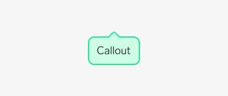
Use the inline type when the callout is part of the page layout and can take up space of its own.
The inline callout sits in the normal content flow and pushes surrounding content aside. It has no shadow, so it reads as part of the page rather than as something floating above it. Because it takes up layout space, it never covers anything.
Choose inline for messages that stay on screen for a while — a hint under a form field, a note next to a price, a tip attached to a setting.
Popover
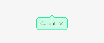
Use the popover type when the callout should float above the page without disturbing the layout.
The popover callout is lifted off the surface with a drop shadow and positioned relative to its anchor. It overlaps whatever is behind it, so it suits short-lived messages: an onboarding hint, a "new feature" pointer, a one-time nudge.
Pair the popover type with a close button so users can get it out of the way.
Sizes
Two sizes are available in Figma, on iOS, and on Android. The difference is the text style and the padding — the small size uses caption text, the default size uses body text. Web has no size property and always renders the default size.
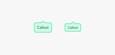
Use default in most places. It matches body text and stays readable at arm's length.
Use small only when the callout sits next to already-small content, such as a caption or a dense list row. A small callout attached to full-size content looks like a mistake rather than a deliberate step down.
Pointer direction
The pointer sits on the edge of the bubble that faces the anchor, so a callout below its anchor points up, and a callout to the left of its anchor points right.
Figma, iOS, and Android offer four directions: top, bottom, leading (left), and trailing (right). Web offers twelve, adding -start and -end alignments to each side — for example bottom-start keeps the bubble aligned to the left edge of its anchor. Anything beyond the four basic directions has no equivalent in the native components, so avoid it in a design that ships on all platforms.
Anatomy
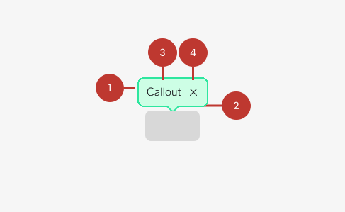
- Container: The bubble. Carries the callout background, a 2px border, and the corner radius — 8px at the default size, 6px at the small size. The popover type adds a medium drop shadow.
- Pointer: The arrow on the edge facing the anchor. It is what makes a callout a callout — without it the component is just a coloured box.
- Message: A single line of text. Callout takes plain text only on iOS and Android; web accepts markup, but the layout is built for one short sentence.
- Close button (optional): Dismisses the callout. Only shown when the callout is dismissible.
Questions?
Feel free to ask any questions on usage in the Warp DS Slack channel: #warp-design-system