
Badge - Usage
Badges label a small piece of metadata—such as a status, category, price, or sponsorship—so people can scan nearby content quickly.
Guidelines
- Use a badge only when its label supports nearby content.
- Give the same label and variant the same meaning throughout your product.
- Make the text carry the meaning. Colour and icons should reinforce the label, not replace it.
When to use
- To show a status, category, count, role, or other compact metadata.
- To identify price or sponsored content on a card or image.
- To highlight a small but important update in a list, card, or dashboard.
When not to use
- For critical feedback or a message that needs a response. Use an Alert.
- For descriptions, instructions, or other long-form content. Use regular page content or a Box.
Behaviour
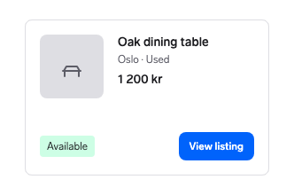
Use a badge for metadata and a Button or Link for the action.
Why: Interactive controls provide the expected focus, hover, pressed, and assistive-technology behaviour.
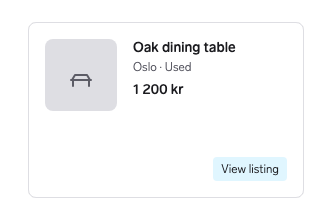
Use a badge as the action itself.
Why: Badges provide no interaction states or control semantics, so people can miss the action.
Placement
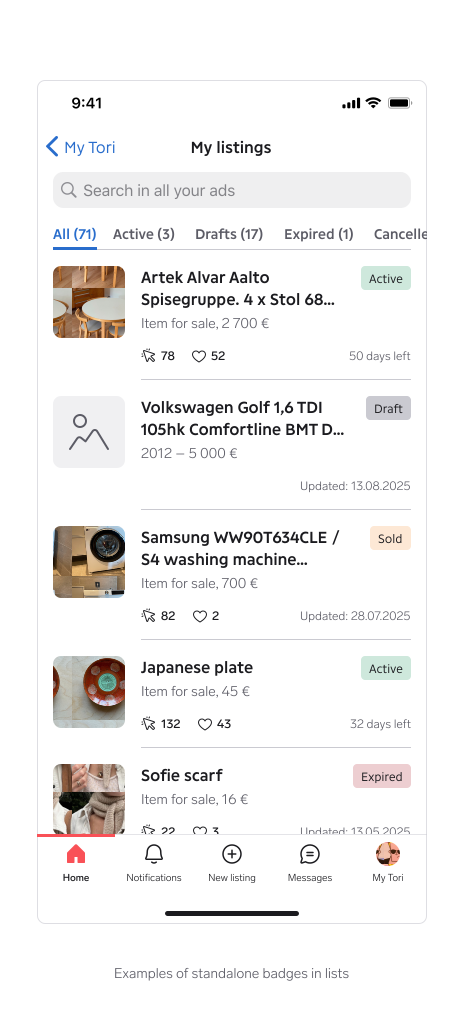
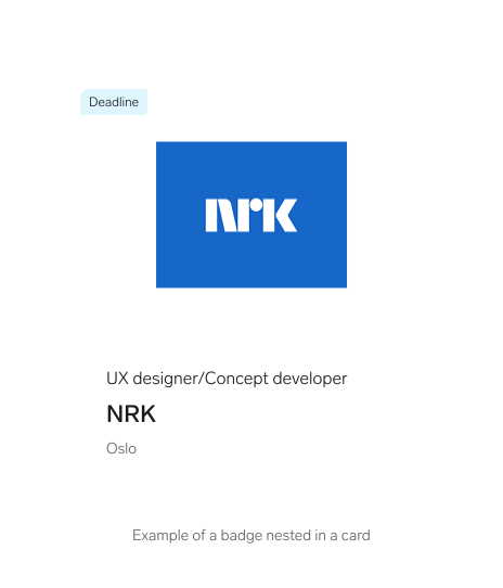
Badges can stand alone or sit inside a parent container such as a card. When you place a badge in a corner, set the appropriate position so its border radius aligns with the container.
Content guidelines
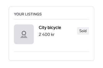
Use a short, descriptive label such as "Sold".
Why: A compact label stays scannable and leaves room for the content it describes.
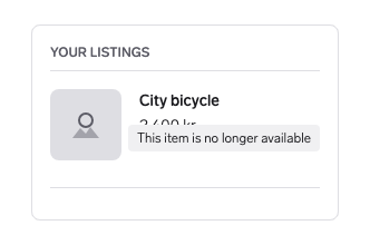
Write a sentence such as "This item is no longer available" inside a badge.
Why: Long labels make the badge compete with or cover nearby content.
Best practices
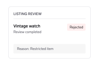
Match the variant to the meaning. Use the negative variant for "Rejected".
Why: The colour supports the label and helps people recognise the outcome quickly.
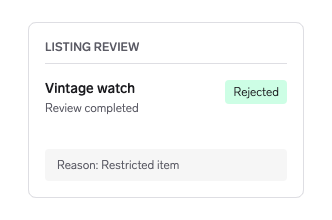
Choose a variant for decoration. A positive "Rejected" badge contradicts its label.
Why: Inconsistent colour meanings make every badge harder to interpret.
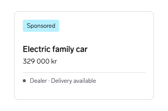
Show one badge with the most important distinction and leave supporting details as regular text.
Why: A single badge preserves a clear visual priority.
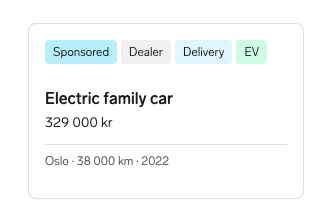
Turn every attribute into a badge.
Why: When every detail is highlighted, none of them stands out.
Questions?
Feel free to ask any questions on usage in the Warp DS Slack channel: #warp-design-system