
Box - Usage
Box is a layout component used for separating content areas on a page. It groups related information inside a subtle surface so users can tell where one block of content ends and the next begins.
See also Alert, Card, and Callout.
Guidelines
- Use Box to group content that belongs together, not to decorate content that already reads fine on its own.
- Give each box a single topic. If you need two headings inside one box, you probably need two boxes.
- Choose the variant by background and relevance, not by tone of voice. Box carries no status — it is never positive, negative, or a warning.
- Set a variant explicitly. On web, a box without
neutral,info, orborderedhas padding and radius but no surface colour. - Do not combine variants.
neutral,info, andborderedare alternatives, not modifiers. - Keep boxes shallow. Nesting a box inside a box makes both surfaces harder to read.
- Never make the whole box clickable. Use Card when the entire surface should be a target.
- Limit the box to one supporting action. Box is not the place for the primary action on a page.
When to use
- To group related content into a distinct block, such as a price summary, a set of delivery terms, or seller details.
- To highlight supporting information that relates to the main content of the page without interrupting the user — use the info variant.
- To separate content on a coloured or low-contrast background, where a plain surface would not read as its own block — use the bordered variant.
- To hold a short block of static content with an optional link or single supporting action.
When not to use
- To tell the user something just happened, or to prompt them to act on it. Use Alert — it is contextual and carries status variants such as positive, negative, and warning.
- To make an entire surface clickable or selectable. Use Card, which is built for interaction and has clickable and selected states.
- To draw attention to an element elsewhere on the page. Use Callout, which points at a target.
- To hide content behind a toggle. Use Expandable, which has a box type built in.
- To convey success, failure, or urgency. Box has no status variants. Reaching for info to signal a problem misleads users.
- To add generic padding or spacing. Use spacing utilities instead — a box implies that its content is a meaningful group.
Behaviour
Content
Box is a container, so its content is up to you. On web, anything can go inside: headings, paragraphs, lists, links, buttons, or other components. The box adds 16px padding and an 8px corner radius, and removes the bottom margin from its last child so the content sits evenly inside the surface.
On iOS and Android the component also offers a structured layout with predefined optional parts — icon, heading, body text, link, and button. The layout adjusts to whichever parts you supply. Android additionally supports a free-form content slot. See the framework pages for exact APIs.
Variants
| Variant | Surface | Choose it when |
|---|---|---|
| Neutral | Subtle sunken grey | The content is generic and not tied to the main focus of the page. This is the default choice. |
| Info | Subtle blue | The content is related or relevant to the main focus of the page and deserves a little more attention. |
| Bordered | Page background with a 2px border | The box sits on a coloured or low-contrast background, or you need visual variation between several grouped blocks. |
Bleed
The bleed option makes the box stretch edge to edge on small screens (below 480px) by removing its horizontal margins and squaring off its left and right corners. From 480px up, the box returns to its normal inset with rounded corners.
Use bleed when the box is the full width of a mobile layout and the side gutters would otherwise waste space. Do not use bleed for a box that sits inside a narrower column — the negative margins will pull it out of alignment with its surroundings.
Stacking and nesting
- Stack boxes vertically with consistent spacing between them. Do not let them touch.
- Avoid nesting a box inside another box. Two subtle surfaces on top of each other read as a rendering mistake rather than a hierarchy.
- If you need visual separation inside a box, use a Divider or headings, not a second box.
States
Box is static. It has no hover, focus, pressed, disabled, loading, or error state, because the box itself is never interactive. The elements inside it — links and buttons — carry their own states.
If you find yourself wanting a hover state on the box, that is a signal you want a Card.
Content guidelines
Heading
Name the group, do not describe it. The heading should tell users what the block contains so they can decide whether to read on.
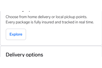
"Delivery options"
Names the content in two words. Users can scan past it if it is not what they need.
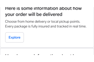
"Here is some information about how your order will be delivered"
A sentence, not a heading. It is slow to scan and will wrap on mobile.
Body text
- Keep it to a short paragraph. If the content runs long, the box is doing the job of a page section.
- Write in present tense and active voice.
- Front-load the point. Users read the first line and skim the rest.
Link and button labels
- Say where the link goes or what the button does. "Read about delivery" and "Change address" work. "Read more", "Click here", and "OK" do not.
- Use one supporting action per box. Two competing actions inside a passive container leaves users unsure which matters.
- Use a secondary or utility button. A primary button inside a box competes with the real primary action on the page.
Placement
Place the box directly next to the content it relates to. An info box about delivery belongs beside the delivery section, not at the bottom of the page.
- Mobile: boxes normally span the full content width. Use bleed when the box should reach the screen edges.
- Desktop: keep the box within its content column. A box stretched across the full page width stops reading as a group and starts reading as a page section.
- Leave clear space above and below so the box separates from surrounding content. That separation is the whole point of the component.
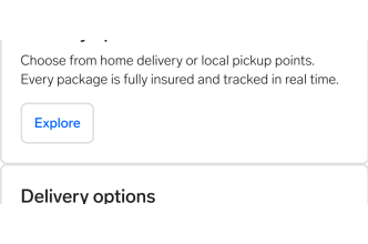
Use the bordered variant on coloured or low-contrast backgrounds.
Why: Neutral and info rely on a subtle fill. On a coloured background that fill disappears, and the grouping disappears with it.
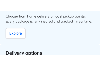
Use a neutral box on a coloured background and adjust the colours yourself.
Why: Custom colours break theming across brands and dark mode, and are likely to fail contrast in at least one of them.
Interaction
The box itself does not respond to input — there is nothing to hover, focus, or click. Users interact only with the elements inside it.
- Links and buttons inside the box follow the normal tab order of the page.
- Keep interactive elements at least 44×44px on web, 44×44pt on iOS, and 48×48dp on Android.
- Do not attach a click handler to the box to make the whole surface a shortcut. It is not focusable, gets no visible focus indicator, and is invisible to keyboard and screen reader users. Use Card.
Questions?
Feel free to ask any questions on usage in the Warp DS Slack channel: #warp-design-system