
Tooltip - Usage
A tooltip is a small message box that appears when a user hovers over, focuses, or taps a UI element. It provides brief, supplementary information about that element.
Guidelines
- Use tooltips for supplementary information only. The interface must still make sense with every tooltip closed.
- Keep the message to one or two short lines.
- Attach a tooltip to a single, clearly interactive trigger using the trigger's
idand the tooltip'sforattribute. - Show only plain text. Tooltips can't hold links, buttons, or images.
- Show one tooltip at a time.
- Position the tooltip so it never covers the trigger or the content the user is reading.
When to use
- Clarify an icon-only control. A filter or sort icon button gains a text label on hover and focus.
- Explain a term. Define domain language such as "Fiks ferdig" or "Financing estimate" at the point where it appears.
- Give context for a value. Explain how a price estimate or delivery date is calculated.
- Explain why a control is unavailable. Tell the user what needs to happen before an action becomes possible.
When not to use
- Don't use for essential instructions. Put the text in the interface, or use a Callout below the field.
- Don't use for interactive content. Use a Popover when the message contains a link, an action, or a close button.
- Don't use for status, warnings, or errors. Use an Alert, which stays visible and is announced to screen readers.
- Don't use for confirmations or decisions. Use a Modal.
- Don't use to restate a visible label. A tooltip reading "Save" on a button labelled "Save" is noise.
- Don't use for long explanations. Link to a help page instead.
Behaviour
Showing and hiding
Tooltips are transient. They appear on demand and disappear as soon as the user moves on.
| Trigger | Shows on | Hides on |
|---|---|---|
| Pointer | Hovering the trigger | Moving the pointer off the trigger |
| Keyboard | Focusing the trigger | Blurring the trigger, or pressing Escape |
| Touch | Tapping the trigger | Tapping the trigger again, or tapping elsewhere |
Show the tooltip on both hover and focus. Hover alone excludes keyboard users; focus alone excludes pointer users.
Never make a tooltip persistent. If the message needs to stay on screen, it isn't tooltip content.
Positioning
On web, the tooltip automatically flips or shifts to stay in the viewport when the trigger moves close to a screen edge.
Pick the placement that keeps the tooltip clear of what the user is looking at:
- Prefer
toporbottomfor triggers in a row of controls. - Prefer
rightorleftfor triggers in a vertical list. - Avoid placements that cover the field a user is about to fill in.
States
- Hidden (default). No tooltip is rendered. This is the state the interface must be usable in.
- Visible. The tooltip is shown, anchored to its trigger with the arrow pointing at it.
- Repositioned. The tooltip has flipped or shifted to stay in view. The arrow follows the new placement.
Tooltips have no hover, pressed, disabled, loading, or error states of their own — those belong to the trigger element.
Disabled triggers
Disabled elements don't fire pointer or focus events, so a tooltip attached to one never opens. If you need to explain why a control is unavailable, attach the tooltip to a wrapper around the control, or keep the control enabled and explain the constraint when the user activates it.
Content guidelines
Write tooltips as short, complete thoughts.
- Keep it under 10 words where you can, and never more than two lines.
- Use sentence case. Skip the full stop on fragments; keep it on full sentences.
- Lead with the answer, not with "This button lets you…".
- Don't repeat the trigger's visible label.
- Don't put anything in a tooltip that the user needs in order to act — they can't read it while typing.
| ✓ DO | ✗ DON'T |
|---|---|
| "Sort results by price" — says what the control does | "Sort" — repeats the icon's obvious meaning |
| "Estimated based on your postcode" — explains where a value comes from | "More info" — tells the user nothing |
| "Select a size before adding to cart" — names the blocker | "Unavailable" — leaves the user stuck |
| Keep it to one or two lines | Write a paragraph that covers the page behind it |
| Plain text only | Links or buttons the user has to move the pointer to reach |
Placement in the interface
Desktop Anchor the tooltip to the control it describes and leave enough space around it that the tooltip doesn't overlap adjacent controls. Use distance to increase the gap when the trigger sits inside a dense toolbar.
Mobile There's no hover on touch, so the tooltip needs an explicit tap. Make that obvious — an info icon next to the label is the clearest pattern. Give the trigger a target of at least 44×44pt (iOS) or 48×48dp (Android), and make sure a tap anywhere outside dismisses the tooltip.
Prefer top or bottom placement on narrow screens. Side placements rarely have room, and a flipped tooltip can end up far from the element it describes.
Best practices
Open on hover and focus
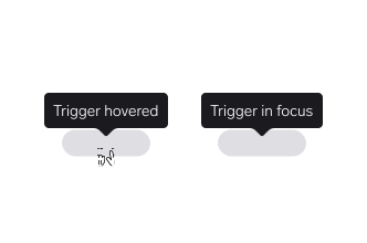
Show the tooltip on both hover and keyboard focus, so every user can reach the message.
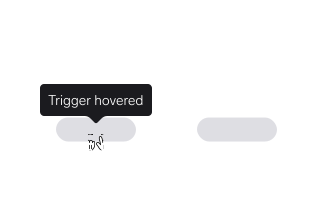
Don't bind to hover alone. Keyboard and screen reader users never see the tooltip, and the information is lost.
Anchor to an interactive trigger
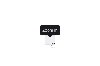
Attach the tooltip to something that clearly looks interactive, like a button or an info icon.
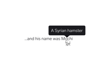
Don't attach it to plain text with no affordance. Users have no reason to hover there, so they never discover it.
Keep essential information outside the tooltip
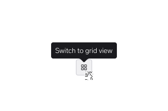
Make sure the interface still works with every tooltip closed. Tooltips add detail; they don't carry the task.
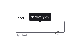
Don't hide anything the user needs in order to act. Tooltip content disappears the moment they move to the field.
One tooltip at a time
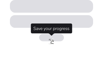
Use a single tooltip per trigger, and show only one at a time.
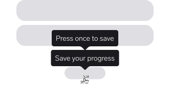
Don't stack or chain tooltips. Overlapping messages compete for attention and obscure the content behind them.
Keep the tooltip in view
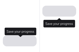
The tooltip automatically flips and shifts whenever the trigger moves near the edge of the viewport, so no additional positioning prop is needed.
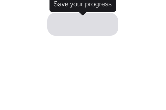
Don't let the tooltip get clipped off-screen. A half-visible message is worse than none.
Make it easy to dismiss
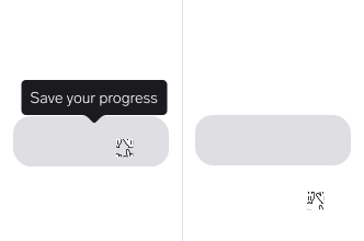
Close the tooltip on Escape, on blur, and when the pointer leaves the trigger.
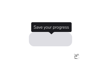
Don't require a precise pointer movement to dismiss it, and never make the tooltip persistent.
Choose the right component for the content
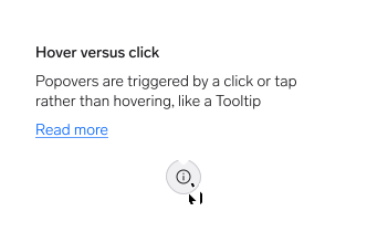
Use a Popover when the message needs a link, a button, or a close control.
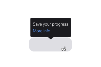
Don't put interactive content in a tooltip. It vanishes on mouse-out and can't be reached by keyboard.
Questions?
Feel free to ask any questions on usage in the Warp DS Slack channel: #warp-design-system