
Alert - Usage
Alerts show high-signal messages meant to be noticed by or prompt users. An alert sits inline in the page, carries a status colour and icon, and stays visible until the situation it describes is resolved.
See also Snackbar, Box, Callout, and Modal.
Guidelines
- Use alerts sparingly. Every alert claims urgency, so a page full of them teaches users to ignore all of them.
- Show one alert at a time per context. If two things went wrong, write one alert that covers both.
- Place the alert next to what it refers to, not at the top of the page by default.
- Match the variant to the severity, never to the colour you want. Green is not a decoration.
- Say what happened and what to do next. An alert that only states a problem leaves the user stuck.
- Never rely on colour alone. The status icon and the wording must carry the meaning too.
- Do not use an alert for content that is always there. Persistent page content belongs in a Box.
- Keep alerts short. Two or three lines. Link out if there is more to say.
When to use
- To report the result of an action the user just took — a payment failed, an ad was published, a form could not be submitted.
- To summarise validation errors at the top of a form, alongside the inline errors on each field.
- To warn about a consequence the user can still avoid — an expiring card, unsaved changes, a listing about to be removed.
- To communicate a service problem that affects what the user is trying to do — a payment provider outage, a delayed sync.
- To confirm something important that the user may want to re-read or screenshot.
When not to use
- For a brief, transient confirmation such as "Copied" or "Saved". Use Snackbar, which overlays content and disappears on its own.
- For static supporting content that is part of the page regardless of state. Use Box, which groups content without claiming urgency.
- To draw attention to a specific element on screen. Use Callout, which points at its target.
- To force a decision before the user can continue. Use Modal, which blocks the interface until the user responds.
- For site-wide operational messages fetched from the communication team. Use Broadcast.
- For a single field's validation error. Use the error state of Text field or the relevant input, so the message sits next to the field it belongs to.
- For marketing or promotional content. Alerts signal status. Using one to advertise erodes trust in every other alert.
Behaviour
Showing and hiding
On web, visibility is controlled by you with the show property. The alert renders nothing until it is shown.
- Show the alert as soon as the condition it describes is true, and keep it visible until that condition changes.
- Do not auto-dismiss an alert on a timer. Users who are reading slowly, using a screen reader, or looking away will miss it. If a message can safely vanish, it should have been a Snackbar.
- Warp's Alert has no built-in close button. If you add your own dismiss control, make sure dismissing does not hide something the user still needs — and remember the choice, so the same alert does not reappear on every page load.
- When an alert appears in response to a user action, move focus to it or to the first field that needs fixing. See Accessibility.
Variants
| Variant | Use when | Do not use for |
|---|---|---|
| Information | The user needs context to continue. Nothing has failed or succeeded. | Static page content — use Box. |
| Warning | Something needs attention but is not yet broken; there is a consequence if the user does nothing. | Problems that have already happened — use negative. |
| Negative | An action failed, something is unavailable, or the user is blocked. | Warnings the user can still avoid. |
| Positive | An important action succeeded and the confirmation should persist. | Low-stakes feedback — use Snackbar. |
States
Alert is a static container: it has no hover, focus, pressed, or disabled state of its own, because the alert itself is not interactive. The links and buttons inside it carry their own states.
The only state that matters at the component level is shown versus hidden. Hiding an alert does not remove your markup — the content stays in the DOM, marked as hidden from assistive technology. Do not treat absence from the DOM as a way to check whether an alert is showing, and do not leave focusable elements inside a hidden alert. See Accessibility.
Actions inside an alert
- Include an action only when it resolves the situation the alert describes. "Retry payment" belongs in a failed-payment alert; "Browse categories" does not.
- Limit the alert to two actions. On iOS this is a primary and a secondary button; on Android a secondary and a quiet button.
- Keep the primary action of the page outside the alert. An alert is a message, not a form.
Content guidelines
An alert is read under pressure — often when something has gone wrong. Write for someone who is skimming and slightly annoyed.
Title
Front-load the outcome. The title should make sense on its own, without the body text.
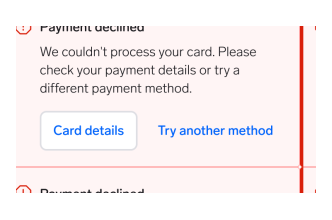
"Payment declined"
Names the outcome, so the title works on its own in a screen reader announcement, in a notification, and for someone skimming the page.
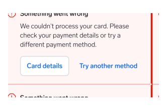
"Something went wrong"
Names a category, not an outcome. The user has to read the body text to learn anything, and still cannot tell whether their money moved.
Body text
- Say what happened, then what to do next. Both, in that order.
- Keep it to two or three lines. Link out for detail rather than expanding the alert.
- Write in plain language and active voice. Avoid error codes unless the user needs them for support — and if they do, put the code at the end.
- Do not blame the user. "The card number is incomplete" reads better than "You entered an invalid card number".
- Do not repeat the title word for word in the body.
Link and button labels
- Name the destination or the action: "See payment details", "Retry payment", "Update card".
- Avoid "Read more", "Click here", and "OK" — they say nothing out of context, and screen reader users often hear links as a bare list.
- Keep labels short enough to survive a narrow mobile layout.
Tone
| Variant | Tone |
|---|---|
| Information | Neutral and factual. |
| Warning | Direct, not alarming. Say what happens if the user ignores it. |
| Negative | Calm and specific. No exclamation marks, no apologies that delay the fix. |
| Positive | Brief and confirming. Do not oversell it. |
Placement
Put the alert where the user is looking when the message becomes relevant.
- Next to its subject: an alert about a payment belongs in the payment section, not at the top of the page.
- Above a form for a validation summary, immediately before the first field, so it is not scrolled past.
- Full content width on mobile. Alerts span the width of their container; do not squeeze one into a narrow column where the icon and text collide.
- Inside the content column on desktop. An alert stretched across the full page width reads as a site-wide banner.
- Never stacked. Two or three alerts in a row cancel each other out. Combine them, or show only the most severe.
- Not fixed to the viewport. An alert scrolls with the page. If the message must follow the user, it is a Snackbar.
Interaction
The alert itself does not respond to input. Users interact only with the links and buttons inside it.
- Interactive elements inside the alert follow the normal tab order of the page.
- Keep touch targets at least 44×44px on web, 44×44pt on iOS, and 48×48dp on Android.
- Do not make the whole alert clickable. It is not focusable, gets no focus indicator, and is invisible to keyboard users.
- When an action inside the alert resolves the problem, remove the alert. Leaving a "Payment declined" alert on screen after a successful retry is worse than showing nothing.
Best practices
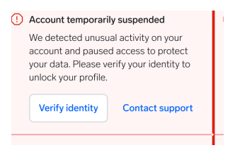
Report a failure with the negative variant.
Why: Users learn the colours faster than they read. A red alert says "this did not work" before a single word is processed.
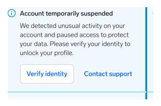
Soften a failure by reporting it in the positive or info variants.
Why: The colour contradicts the message. Once green or blue can mean failure, the variants stop carrying information anywhere in the product.
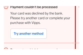
Say what happened, then how to get out of it.
Why: The alert exists to unblock the user. A cause and a next step turn a wall into a detour.
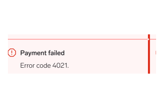
Report the problem and stop there.
Why: An error code is for your logs. The user is left guessing whether to retry, wait, or call support — and many will simply leave.
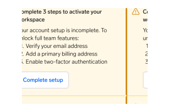
Combine everything wrong in one context into a single alert.
Why: One message gets read and acted on. It also announces once to a screen reader instead of three times.
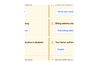
Stack an alert per problem.
Why: Each one claims to be urgent, so none of them is. Users start skipping the whole region — including the alert that actually matters.
Questions?
Feel free to ask any questions on usage in the Warp DS Slack channel: #warp-design-system