
Snackbar - Usage
Snackbars provide brief, contextual feedback about an operation or system status at the bottom of the screen. They inform users about processes, confirmations, warnings, or errors in a non-intrusive way.
Note: The Toast component is deprecated. Use Snackbar for all toast-style notifications.
See also Alert.
Guidelines
Snackbars are best suited for providing quick, non-intrusive feedback without interrupting the user's workflow.
Use appropriate semantic type (positive, warning, negative, info, neutral) to match message context.
Always include action buttons with descriptive labels when users can respond to the notification.
Snackbar items automatically disappear after a predefined timeout of 5000 ms ('short'), 20000 ms ('long') or 'infinite' (6000000 ms), depending on the context or the length of the message. Queue messages and show maximum 3 snackbars at once to maintain clarity.
Stack vertically from bottom to top. Queue additional messages and show them as space becomes available. Most recent message appears at the top of the stack.
Snackbar items have a minimum width of 328px, and a maximum width of 420px to maintain readability on wide viewports.
When to use
Use to confirm that an action was completed successfully ("Item added to favorites").
Use to provide feedback about an ongoing process ("Uploading 3 of 5 files").
Use to alert users to non-critical errors that don't prevent continued use ("Failed to load preview").
Use to offer simple undo functionality for destructive actions ("Message deleted" with Undo button).
When not to use
Don't use for critical errors requiring immediate attention. Use Modal or Alert instead.
Don't use for complex messages with multiple paragraphs. Use Modal or dedicated error pages.
Don't use for form validation errors. Show errors inline near the invalid fields with Text field error states.
Don't use for permanent information. Use Alert or Callout for persistent messages.
Behaviour
Standardise the Snackbar logic across our apps to build user trust. When interaction rules remain consistent, users can focus on reading messages rather than relearning how the component works.
Review the behaviour guidelines for each snackbar element below.
Duration
Snackbars automatically disappear after a predefined timeout:
Short (5000 ms): Brief confirmations without actions ("Item saved", "Copied to clipboard").
Long (20000 ms): Messages with actions or longer text ("Message deleted" with Undo button).
Infinite (6000000 ms): Critical messages requiring acknowledgment (errors, warnings with close button).
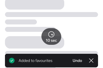
Use long or infinite duration for snackbars with action buttons to give users time to read and act.
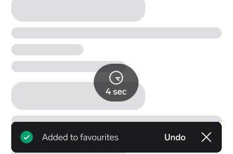
Auto-dismiss snackbars with actions in 4 seconds before users can interact.
Message text
Write clear, concise messages in past tense for completed actions: "Item saved", not "Item has been saved". Keep messages to one sentence, typically under 60 characters. Avoid jargon and use plain language users understand.
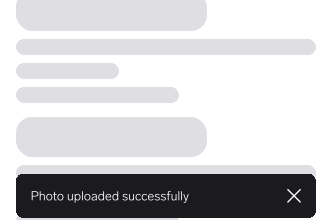
Write specific messages: "Photo uploaded successfully" tells users exactly what happened.
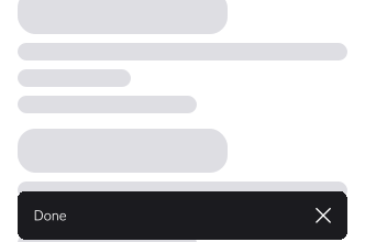
Use vague messages like "Success!" or "Done" without context about what action completed.
Type
Choose the appropriate semantic type to match your message context:
- Positive: Successful operations and confirmations.
- Warning: Non-critical alerts needing attention.
- Negative: Errors and failed operations.
- Info: Neutral informational messages.
- Neutral: General system notifications.
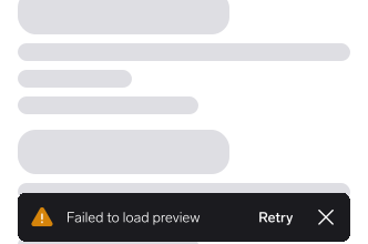
Match type to message: negative for errors, positive for success, warning for alerts.
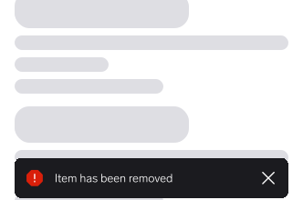
Use error styling (negative) for neutral information or success confirmations.
Action buttons
Use action-oriented, concise labels (1-2 words): "Undo", "Retry", "View", "Dismiss", "Learn more".
The action should be directly related to the snackbar message. Only include one action per snackbar. Action execution should dismiss the snackbar. Always use long or infinite duration when including an action button.
Close button
Include a close button when the message contains an action button (allows dismissal without acting), when the message is important and users may need time to read, or when error or warning messages require acknowledgment.
Placement
Web
Desktop:
- Bottom center of viewport, at least 16px from bottom edge.
- Minimum width 328px, maximum width 420px.
- Horizontally centered.
Mobile:
- Full width with 16px horizontal padding.
- Bottom edge aligned with screen bottom or above bottom navigation.
iOS & iPadOS
- Above tab bars, bottom navigation, and floating action buttons.
- Respects safe areas (especially on devices with home indicators).
- 16pt margin from safe area edges.
- Minimum width 328pt, maximum width 420pt.
Android
- Above bottom navigation bars and FABs.
Interaction
Mouse/Touch:
Tapping the message area does nothing (prevents accidental dismissal). Tapping the action button executes the action and dismisses the snackbar. Tapping the close button dismisses immediately. Swiping horizontally (mobile) dismisses the snackbar.
Keyboard:
- Alt+Enter (Opt+Enter on Mac): Focus snackbar when it appears.
- Tab: Move focus to action button, then close button (if present).
- Enter/Space: Activate focused button.
- Escape: Dismiss snackbar.
Platform-specific patterns
Web
Keyboard shortcut tooltip:
A tooltip displays the keyboard shortcut (Alt+Enter / Opt+Enter) when users navigate with keyboard. The tooltip is not visible by default; it appears only during keyboard navigation to provide contextual hints and helps users discover they can jump directly to the snackbar.
Consider:
- Keyboard focus management when snackbar contains actions.
- Touch targets minimum 44×44px for mobile.
iOS
Follow iOS Human Interface Guidelines:
- Use system-provided haptic feedback for confirmation snackbars.
- Support Dynamic Type for text scaling.
- Provide VoiceOver labels and hints.
- Minimum touch target 44×44pt.
Android
Follow Material Design 3 principles:
- Support TalkBack screen reader.
- Minimum touch target 48×48dp.
- Elevation and shadow for depth.
Questions?
Feel free to ask any questions on usage in the Warp DS Slack channel: #warp-design-system