
Slider - Usage
Sliders allow users to adjust a single value within a defined range by moving a handle along a horizontal track.
Guidelines
- Sliders are best suited for when people need to quickly set a value within a designated range. They offer an intuitive way to adjust settings like volume, price filters, or relative distances.
- Use step intervals (integers) when precision input is required.
- Always display a tooltip while dragging to show the selected value.
- Ensure the slider is wide enough to be easily operated on touch devices.
- Avoid disabling sliders. They provide poor accessibility feedback, and it’s unclear why the option is unavailable.
When to use
- Use to allow users to see their selection relative to a minimum and maximum.
- Use to provide a wide range of options within a compact space.
- Use when users should see the results of their selection in real-time.
When not to use
- Don’t use sliders for small ranges (e.g., 1-10). Use a Checkbox or Stepper instead (Note: Steppers are not yet available in Warp; please reach out if your use case requires one).
- Don’t use for complex input values that aren’t numeric (e.g., categories or words). Use a Select, Checkbox, Radio, Pill, or Text field instead.
- Don’t use when both minimum and maximum values need to be defined. Use the Range slider instead.
Behaviour
Text fields
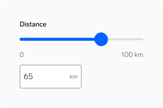
By default, the Slider is paired with a text field. This allows users to choose between quick sliding or precise typing.
Always use a text field when:
- Users need or expect to enter exact values.
- The value can reasonably be typed.
Removing the text field is an exception. Only do this when:
- The value cannot be meaningfully entered as free text.
- The range is adjusted in fixed steps.
- Precision is controlled by the system, not the user.
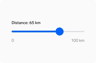
Example: Selecting a search radius on a map. Users usually explore the distance by sliding rather than typing an exact or arbitrary number.
Displaying values without text fields
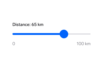
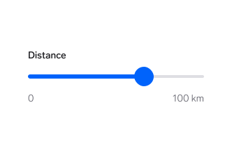
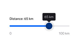
When using the Slider without a text field, the selected value must be visible at all times and easy to read.
Units and formatting
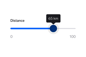
When there is no text field, units must be explicitly shown with the value.
Dynamic units and values
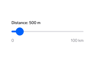
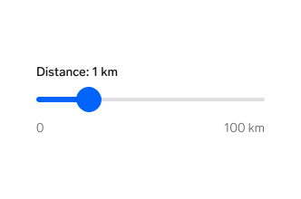
In some contexts, units may change dynamically to stay relevant to the user based on scale or context.
⚠️ A note on implementation
Specific rules for step sizes and unit thresholds (e.g., metres to kilometres) are defined by individual product teams, not the design system.
Other slider elements
There aren’t many use cases for the single-handle Slider across Vend marketplaces. For a full specification of its elements and best practices, please refer to the Range slider documentation, which serves as the primary guide for both components.
Questions?
Feel free to ask any questions on usage in the Warp DS Slack channel: #warp-design-system