
Radio - Usage
Radio buttons let users select one option from a set of mutually exclusive choices.
See also Checkbox, Select, Switch, and Radio buttons.
Guidelines
When to use
- Use Radio when users choose one option from a short list of mutually exclusive choices.
- Show every option at once when comparing them helps users decide.
- Use Radio when changing the selection should replace the current value, not turn an independent setting on or off.
- Keep the list short enough to scan. As a rule of thumb, two to seven options work well.
When not to use
- For multiple selections, use Checkbox.
- For a long or space-constrained list, use Select or Combo box.
- For a setting that takes effect immediately, use Switch.
- Do not use a single Radio option. A choice needs at least two alternatives; use Checkbox for an acknowledgement or optional condition.
- Do not use Radio to navigate between pages or views. Use Tabs or links instead.
Selection
Selecting one option clears the previous selection in the same group. The selected value should remain visible when users return to the step or review their answers.
Choose the initial state deliberately:
- Start with no selection when the user must make an explicit choice, especially for consent, eligibility, delivery, or payment decisions.
- Preselect a value only when there is a safe, expected default that does not steer users toward a consequential choice.
- Never reset the group after a validation error or an unrelated change elsewhere on the page.
On Web, a shared name connects the options for form submission. On all platforms, keep each option's value stable and distinct from its visible label so copy can change without changing stored data.
Grouping and layout
Give the group a short visible label that completes the question the options answer. Add help text before users interact if they need context to make the choice.
- Arrange options vertically by default. This is easiest to scan and gives long or translated labels room to wrap.
- Use a horizontal layout only for a few short, familiar labels, such as “Yes” and “No”. Test it at narrow widths and large text sizes.
- Keep related options together and separate different groups with enough space that their labels cannot be confused.
- Make the option label part of the click or touch target. Users should not have to hit the circular control precisely.
- Keep the order stable. Do not move the selected option to the top.
Validation and errors
Validate a required group after the user tries to continue, not while they are still reviewing the options. Mark the group as invalid and place one specific error message next to it.
- Explain what resolves the error: “Choose a delivery method”, not “Invalid value”.
- Keep the group label, options, and error together.
- Preserve any valid selection when the form contains another error.
- Move focus to the group or include it in a linked validation summary after a failed submission.
- Do not disable the submit action solely because the group is empty; letting users submit exposes the validation message to keyboard and screen reader users.
Content guidelines
Group label
Write a question or short instruction that gives every option the same context. “How should we deliver your item?” is clearer than “Method”. Do not put required information only in help text.
Option labels
- Use short, parallel labels that describe the choices, such as “Pick up” and “Ship to me”.
- Start each label with the words that distinguish it from the other options.
- Avoid repeating the group label in every option.
- Do not use punctuation at the end of short labels.
- Let labels wrap. Do not truncate choices or replace meaningful words with tooltips.
- If an option needs a longer explanation, keep the label concise and add supporting text without placing links or other controls inside the clickable label.
Best practices
Match the control to the choice
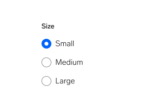
Use Radio for one choice from a visible set of alternatives.
Why: The options are mutually exclusive, and users can compare all of them before choosing.
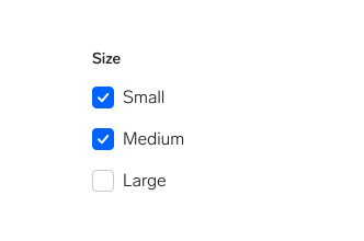
Use checkboxes when selecting one option must clear the others.
Why: Checkboxes communicate that several choices may be selected at the same time.
Label the whole group
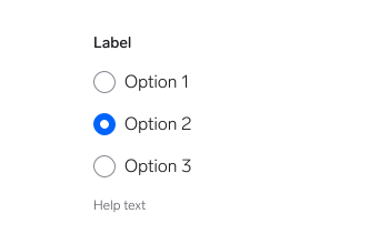
Give related options one clear group label.
Why: The label explains the relationship between the choices and gives assistive technology a name for the group.
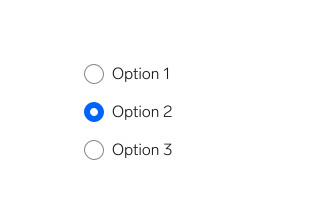
Present options without saying what question they answer.
Why: Users have to infer the meaning, and screen reader users lose the context that connects the options.
Questions?
Feel free to ask any questions on usage in the Warp DS Slack channel: #warp-design-system