
Tabs - Overview
Tabs organise related content into sections that sit at the same level, and let people switch between them without leaving the page.
Example
Overview
A set of tabs is a single control. Only one tab is selected at a time, and selecting a tab swaps the panel below it. The rest of the page stays exactly where it is.
Tabs work when the sections are peers — alternative views of the same thing, which a user might want in any order. They don't work for steps in a sequence, for navigating to another page, or for content that people need to compare side by side.
Keep the set small. Tabs put every section label on screen at once, so their value comes from being scannable in a single glance.
Related components
- Steps — for a sequence the user works through in order.
- Expandable — for sections that can be open at the same time, or read one after another.
- Pill — for filtering or narrowing a single list of results.
- Breadcrumbs — for showing where a page sits in a hierarchy.
- Select — when there are too many options to show as tabs.
Anatomy
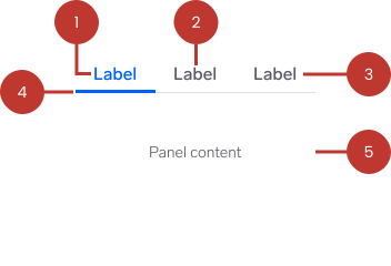
- Tab list — the container holding the full set of tabs. A thin rule runs along its bottom edge, separating the tabs from the panel.
- Tab — one selectable section header. Every tab in the list belongs to the same control.
- Label — the text naming the section. Optionally preceded or topped by an icon.
- Active indicator — a 3px underline in the primary colour marking the selected tab. The selected label takes the same colour.
- Tab panel — the content for the selected tab. Only one panel is visible at a time.
Variants
Label
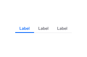
Text-only tabs. This is the default and the right choice almost every time — a clear noun does more for scanning than an icon does.
Icon + label
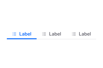
An icon sits beside the label. Use icons only when they carry meaning the label can't — a map view versus a list view, for example. Give every tab in the set an icon, or none of them.
On elements (web) you can set over on a tab to stack the icon above the label instead. That layout is not in the design library yet, so check with a designer before using it.
States
A tab is either selected or not. The tab list itself has no states of its own.

Unselected — grey label, no indicator. The panel it controls is hidden.

Selected — the label turns primary blue and the 3px indicator appears. Exactly one tab is selected at all times.

Hover — shown here as the design library defines it, which is currently the same treatment as the selected tab. Because that makes a hovered tab indistinguishable from the selected one, confirm the intended hover styling with a designer before relying on it.
Focus is drawn by the platform's focus ring on the tab itself; it is not a separate visual in the library. See Accessibility.
There is no disabled tab in Warp. A tab whose content isn't available yet should be removed from the set, not greyed out — see Usage.
Platform considerations
Web<w-tabs> owns the selection state and the keyboard behaviour. Each <w-tab> points at its panel with a for attribute matching the panel's id. The tab row sizes each tab to its label and does not scroll, so keep the set short enough to fit the narrowest screen you support. See Elements, React, and Vue.
AndroidWarpTabRow supports two layouts. Set scrollable to choose between them.
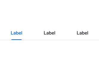
Fixed (scrollable = false, the default) — tabs divide the available width equally. Use for two to four short labels.
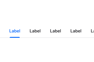
Scrollable (scrollable = true) — tabs size to their labels and the row scrolls horizontally. Use when the labels won't fit. Make sure part of the next tab is visible so people can tell there's more.
Android tabs are 48dp tall, meeting the platform's minimum touch target. See Android.
iOS/iPadOS The iOS package ships Warp.Tabs, which takes an array of Warp.TabItem and a selectedIndex binding. See iOS.
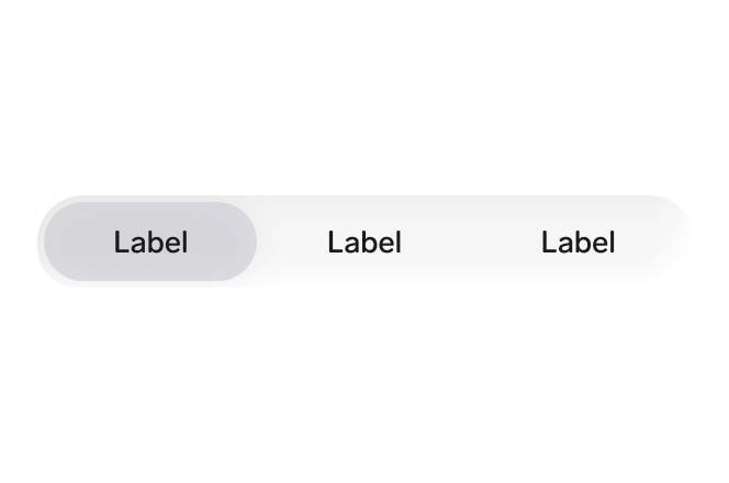
The iOS design library documents this pattern as a segmented control — a rounded track with the selected segment raised — rather than the underlined row used on web and Android. There is no iOS tab artwork in the library, so confirm which of the two a screen should use with a designer before building.
Questions?
Feel free to ask any questions on usage in the Warp DS Slack channel: #warp-design-system