
Box - Overview
Box is a layout component used for separating content areas on a page. It groups related information inside a subtle surface so users can tell where one block of content ends and the next begins.
See also Alert, Card, and Callout.
Examples
General
Box is a passive container. It does not interrupt the user, it does not carry a status, and it is not clickable as a whole. Its job is to visually separate a chunk of content from the rest of the page so the page becomes easier to scan.
Because Box is a container, everything meaningful lives inside it. Any content is allowed on web: text, headings, lists, links, buttons, or other components. On iOS and Android the component also offers a structured layout with predefined slots for an icon, heading, body text, link, and button — see the framework pages for details.
Box is available in three types: Neutral, Info, and Bordered. The types are mutually exclusive — pick one. On web the variant is opt-in, so a box with no variant set renders padding and corner radius but no surface colour. Always set a variant explicitly.
Variants
Neutral
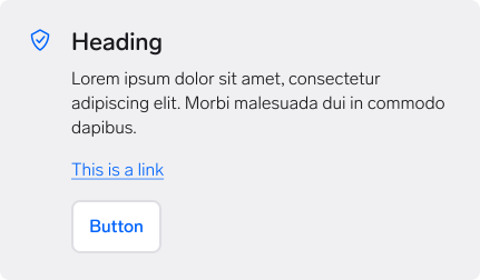
Use the neutral variant to group information that separates itself from other elements in a page layout.
Choose neutral when the content is generic and not necessarily tied to the main focus of the page — for example a summary block, a set of terms, or supporting details. It is the default in Figma and on the native platforms, and the safest choice when you are unsure.
Info
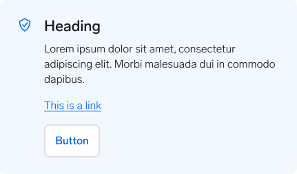
Use the info variant to highlight content that is related or relevant to the main focus of the page.
Info differs from an Alert with the info variant. An alert is contextual and prompts the user to act on something that just happened. An info box is persistent page content that happens to deserve a little more attention.
Bordered
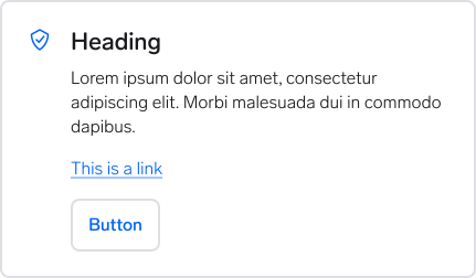
Use the bordered variant on coloured or low-contrast backgrounds, where a neutral or info box would not read as a separate surface.
It also works as an alternative way to group information on a page that already uses several neutral boxes and needs visual variation.
Anatomy
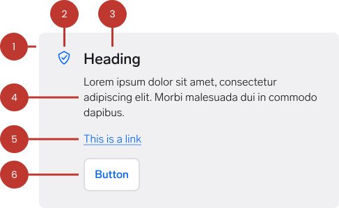
- Container: The surface that holds the content. Carries the background, optional border, and corner radius that define the variant.
- Icon (optional): Reinforces the topic of the box. Decorative in most cases — do not use it as the only carrier of meaning.
- Heading (optional): Names the group of content. Keep it short and descriptive.
- Body text (optional): The main content of the box.
- Link (optional): Takes the user to related content elsewhere.
- Button (optional): A single supporting action. Use a secondary or utility button — the box is never the primary action on a page.
Note: a labelled anatomy diagram with numbered callouts is not yet available in Figma. The illustration above shows the info variant with all optional parts enabled.
Questions?
Feel free to ask any questions on usage in the Warp DS Slack channel: #warp-design-system