
Callout - Usage
Callouts are snippets of information, drawing attention to important content. A callout is anchored to something on screen — a button, a field, a piece of copy — and points at it with an arrow.
See also Tooltip, Popover, Alert, and Box.
Guidelines
- Anchor every callout to a specific element. A callout with nothing to point at is just a coloured box — use Box instead.
- Keep the message to one short sentence. iOS and Android accept a plain string only: no headings, no links, no buttons.
- Choose the type by whether the callout may cover content: inline takes up layout space, popover floats above it.
- Show the callout deliberately. It is hidden until your code shows it, and it never hides itself.
- Make popover callouts dismissible. A floating bubble the user cannot get rid of is an obstacle.
- Do not use the callout colour to signal status. It is the same colour whatever the message says.
When to use
- To explain what an element does the first time a user meets it — a new filter, a boost option, a saved-search toggle.
- To highlight a feature that is easy to miss, pointing directly at the control that activates it.
- To attach a short hint to a form field or setting that stays visible while the user works — use the inline type.
- To run a short onboarding nudge over an existing screen — use the popover type, one step at a time.
When not to use
- To report that something just happened, succeeded, or failed. Use Alert for contextual status messages, or Snackbar for transient confirmation.
- To describe an icon or an unlabelled control on hover. Use Tooltip, which is built for hover and focus and disappears on its own.
- To hold more than a sentence, or anything with a heading, a list, a link, or a button. Use Popover for richer floating content, or Box for content that belongs in the page.
- To group content on the page. Use Box.
- To ask the user to make a decision. Use Modal.
- To carry legal, pricing, or safety information. The callout is dismissible and easy to overlook; that content belongs in the page itself.
Behaviour
Visibility and dismissal
Callout is always under your control. There is no timer, no auto-hide, and — with one exception — no automatic dismissal. The details differ by platform, so check the row you are building against.
| Web (Elements) | iOS | Android | |
|---|---|---|---|
| Shown by | the show property | presenting the view yourself | CalloutState.isVisible |
| Close control | can-close renders a close button | the close icon appears when you pass an onTapped handler to .popover | closable renders a close icon |
| Effect of the close control | emits a close event — your code must then set show to false | calls your handler; tapping anywhere on the bubble calls it too | calls onDismiss |
| Tapping outside | does not dismiss | does not dismiss | dismisses the popover type by default (dismissPopoverOnClickOutside) |
| Escape key | closes it only while the close button has keyboard focus | not applicable | not applicable |
The web behaviour catches people out: clicking the close button fires an event but does not hide anything. If you forget to update show, the callout stays on screen and the close button appears broken.
Positioning
The inline type sits in the content flow and needs no positioning logic. The popover type is placed against its anchor, and how much help you get depends on the platform.
- Web, inline type (
callout): the component positions the arrow only. The bubble stays wherever your own layout puts it, sodistancehas no effect and nothing is recalculated on scroll or resize. Two things follow: lay the bubble out so it is centred on its target, or the arrow will point past it; and add the gap between the bubble and its target yourself — 8px matches the other types. - Web, popover type (
highlight): positioned with Floating UI,distance8px from the anchor by default — which the arrow fills, so raise it to 16px if you want clear space.flipis off by default, so a callout near the edge of the viewport stays where you put it and can end up clipped. Turnflipon, and optionally listfallback-placements, whenever the anchor can be near an edge. Position is recalculated on scroll, resize, and click. - iOS does not position the callout for you.
arrowEdgeandarrowOffsetonly decide where the arrow is drawn — you lay the view out yourself, and there is no collision handling. - Android positions the popover type against the anchor view you pass in, nudged by
horizontalOffsetandverticalOffset. When the bubble is too wide to be centred on its anchor, pass the parent layout'spaddingOffsetso the arrow still lines up. There is no flipping.
States
Callout is static. It has no hover, pressed, disabled, loading, or error state — the bubble either is on screen or is not. The close button carries its own states, and on web it is a Warp button with a normal focus indicator.
There is also no entry or exit animation on any platform. The callout appears and disappears immediately.
Content guidelines
The message is the component. Write one sentence that says why the user should care about the element the arrow points at.
- Keep it to a single line. Around 60 characters fits on a small phone without wrapping.
- Say what the user gets, not what the interface is. "Boosted ads get 3x more views" beats "This is the boost button".
- Do not repeat the label you are pointing at. The user can already read it.
- Plain text only. iOS and Android take a single string, so a message that relies on a link or bold text will not survive the port.
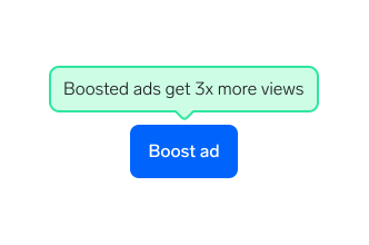
One line, one idea, and a concrete reason to press the button underneath.
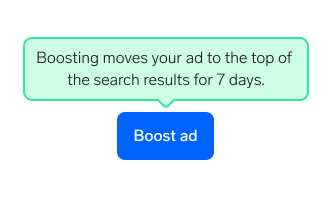
This is page content in a speech bubble. It covers the screen, and the link and line breaks do not exist on iOS or Android.
Placement
Put the callout next to the element it describes, close enough that the arrow lands on it.
- Above or below is the safest default. Left and right placements have less room on a phone and wrap sooner.
- Leave the anchor visible. If the bubble covers the button it is describing, move it to the other side.
- Mind the edges. On web, switch
flipon when the anchor can sit near the edge of the viewport; on iOS and Android there is no collision handling, so check the smallest supported screen yourself. - Do not anchor to something that scrolls away while the callout stays put. On web the position is recalculated on scroll, but a bubble chasing an off-screen anchor still ends up pointing at nothing.
Interaction
- The bubble is not a button. On web and Android the only interactive part is the close control; on iOS the popover type is different — a tap anywhere on the bubble triggers your
onTappedhandler, so treat the whole callout as the dismiss target there. - Keep the close control at least 44×44px on web, 44×44pt on iOS, and 48×48dp on Android. The icon itself is smaller than this on the native platforms — see Accessibility.
- Do not put an action inside the callout. There is no room for a button, and no platform supports one.
- Do not stack a callout on top of a modal, a sheet, or another floating surface. The layering is not defined and the arrow will point at the wrong layer.
Best practices
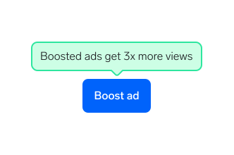
Place the bubble so the arrow lands on the element it describes.
Why: The arrow is the only thing linking the message to a control. Land it on the wrong element and the message describes the wrong thing.
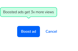
Pin the callout to a fixed spot on the screen and let the arrow point at whatever is behind it.
Why: Users read the arrow first. Pointing at empty space makes the message look like a floating banner they can ignore.
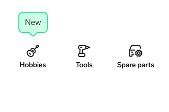
Show one callout at a time.
Why: A callout works by being the only thing asking for attention. If a flow needs several hints, show them one after another as the user moves through it.
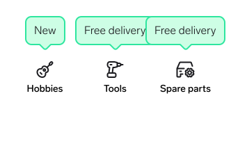
Open a callout on every new control at once.
Why: Three bubbles compete with each other and cover the screen they are meant to explain. Nothing stops them overlapping — no platform manages collisions between callouts.
Questions?
Feel free to ask any questions on usage in the Warp DS Slack channel: #warp-design-system