Skip to content

Checkbox - Usage ​

AndroidreleasedElementsreleasediOSreleasedReactreleasedVuereleased

Guidelines ​

Use Checkbox when ​

  • toggling an option on/off.
  • selecting multiple values from several options.
  • a collection of options share context.

Avoid Checkbox when ​

  • you need to restrict selection to a single option. Use a Radio button, Switch or Select instead.
  • a checkbox requires a submission step (e.g., clicking "Save" or "Submit"), instead use Switch to trigger immediate state change (no save required).

Options ​

Selection states ​

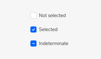
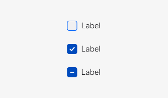
A list of three checkboxes showing selection states: not selected, selected, indeterminate
Checkboxes have three states of selection: Not selected (the default state), Selected and Indeterminate. Indeterminate is used when there are nested levels of checkboxes, and indicates that there are some checkboxes selected at the level below. Clicking this subsequently selects all of those checkboxes.

Label ​

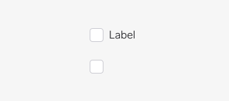
A list of two checkboxes, one with, and one without a label
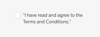
Checkboxes should always have a label. When the label is not defined, a checkbox becomes standalone. Standalone checkboxes are only used when their connection to other content is clear and they give sufficient context — for example, in application panels.

Error ​

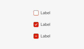
A list of three error checkboxes shown in the interactive states: not selected, selected, indeterminate
Checkboxes can be marked as having an error to show that a selection needs to be made in order to move forward, or that a selection that was made is invalid. For example, in a form that requires a user to acknowledge legal terms before proceeding, the checkbox would show an unchecked error to communicate that it needs to be selected.

Disabled ​

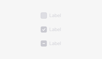
A list of three disabled checkboxes shown in the interactive states: not selected, selected, indeterminate
A checkbox in a disabled state shows that a selection exists, but is not available in that circumstance. This can be used to maintain layout continuity and communicate that an action may become available later.

Checkbox group ​

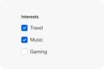
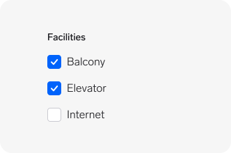
A list of three checkboxes in a list with a label above them
Checkboxes can be used alone or in a list (checkbox group). When used in a group they must include a label to describe what the choices are related to.

Behaviour ​

Interactive label ​

A checkbox with a hand cursor icon pointing at the label to visualise the hover state
The label is included in the interactive click/touch area of the checkbox. Clicking/tapping on the checkbox or label will select/deselect the checkbox.

Keyboard focus ​

A list of three focused checkboxes shown in the interactive states: not selected, selected, indeterminate
Checkboxes has a visible focus ring when in focus. This only becomes visible when landing on a checkbox when using a keyboard to navigate through page elements.

Text overflow ​

A checkboxes with long label text that wraps over two lines
When the label is too long for the horizontal space available, it wraps to form another line.

Checkbox or radio? ​

Do, white checkmark on a green background

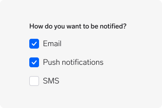
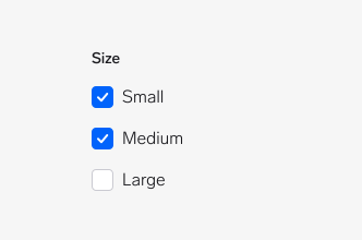
Checkboxes and radio buttons are not interchangeable. A set of checkboxes should be used to select as many options as desired (or none).
Don't, white x on a red background

A set of radio buttons should be used to select only a single option from a list of mutually exclusive options.

Do, white checkmark on a green background

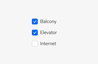
Always have a clear label that describes what the list of options represents and guides users what to do. This is important for accessibility, since a screen reader will read the label before each option.
Don't, white x on a red background

Don’t make the user have to guess or assume what the information means.

Representing mixed values ​

Do, white checkmark on a green background

When a checkbox presents multiple values that are not identical, the checkbox should appear as indeterminate. Any subsequent click or tap should select the checkbox, and update all values. Another click or tap after that should deselect the checkbox, and update all values to be not selected.

Don't, white x on a red background

Don’t forget to make sure that nested checkbox lists have a connection between the parent checkbox and the child options.

Questions? ​

Feel free to ask any questions on usage in the Warp DS Slack channel: #warp-design-system