
Tabs - Usage
Tabs organise related content into sections that sit at the same level, and let people switch between them without leaving the page.
Guidelines
- Use tabs only for sections that are peers — alternative views of one subject, readable in any order.
- Keep the set to two to five tabs. One tab is not a tab set; too many stop being scannable.
- Always keep exactly one tab selected, including on first load.
- Write short noun labels — one or two words.
- Keep the whole set on one line, without wrapping.
- Never nest one set of tabs inside another.
- Switching tabs must change the panel only. It must not navigate, submit, or reload.
When to use
- Alternative views of the same object. A listing page with Overview, Specifications, and Reviews.
- Splitting a long page into scannable sections. When the content is too long to read in one scroll but each part stands on its own.
- Switching a display mode. List and Map views of the same set of results.
- Grouping settings by area. Profile, Notifications, and Privacy in an account screen.
When not to use
- Don't use for a sequence. If the user must finish one part before the next, use Steps.
- Don't use when sections are read together. If people need to compare two sections or see them at once, use Expandable or put both on the page.
- Don't use for page navigation. Tabs swap a panel. To move between pages, use links and Breadcrumbs.
- Don't use for filtering a list. Use Pill to narrow results within one view.
- Don't use for more than about five options. Use a Select, or restructure the page.
- Don't use for a single section. Drop the tab and use a heading.
- Don't use for a decision the user must make. Use a Modal or Button group.
Behaviour
Selection
One tab is always selected. Set the initial selection explicitly rather than leaving it to chance:
| Framework | How to set the initial tab |
|---|---|
| Elements | active on <w-tabs>, holding the panel's id |
| React | active on Tabs, or isActive on a Tab |
| Vue | v-model on w-tabs, holding the tab's name |
| iOS | the selectedIndex binding |
| Android | selectedTabIndex on WarpTabRow |
If you don't set one, the first tab is selected. Make the first tab the one most people need, and keep the order stable — don't reorder tabs based on usage or state.
Switching
Selecting a tab swaps the panel immediately. Nothing else on the page moves. Scroll position outside the panel stays where it was.
Selection is automatic: moving to a tab with the arrow keys selects it and shows its panel straight away. Keep panel content cheap enough to render that arrowing through the set stays smooth.
Overflow
Web tabs size to their labels and the row does not scroll. If the set is too wide, tabs wrap onto a second line — which breaks the single-control reading and buries the last tabs. Prevent it by shortening labels or cutting tabs, not by letting it wrap.
Android offers scrollable = true, which sizes tabs to their labels and scrolls the row horizontally. Leave part of the next tab visible so the scroll is discoverable.
Loading content
Load the first panel with the page. Panels can be loaded when first selected, but:
- Reserve the panel's height so the page doesn't jump when content arrives.
- Show a Spinner inside the panel, not over the tab row.
- Keep the tab row interactive while a panel loads, so people can change their mind.
Deep linking
If a tab represents something worth returning to — a shared link, a bookmark, a back-button step — reflect the selected tab in the URL and restore it on load. If it doesn't, don't add a history entry for every tab click; that traps people who press back expecting to leave the page.
States
| State | When it occurs | What the user should understand |
|---|---|---|
| Unselected | The tab's panel is hidden | This section exists and can be opened |
| Selected | The tab's panel is showing | This is the section I'm reading |
| Hover | Pointer is over the tab | This tab is clickable |
| Focus | The tab has keyboard focus | Pressing an arrow key moves between tabs |
There is no disabled tab. If a section isn't available, leave it out of the set — a greyed-out tab tells people something exists without telling them how to get it, and it can't hold a tooltip explaining why.
Content guidelines
Tab labels are the only description of what's inside, so they carry a lot of weight.
- Use nouns, not verbs. A tab names a place, not an action.
- Keep to one or two words. Long labels crowd the row and truncate first on mobile.
- Use sentence case, and no punctuation.
- Make labels parallel. Every label in the set should be the same kind of thing.
- Don't number them. Numbers imply an order the user has to follow.
- Don't repeat the page title in every label.
| ✓ DO | ✗ DON'T |
|---|---|
| "Reviews" — one word, says exactly what's inside | "See all customer reviews" — a sentence, truncates on mobile |
| "Overview" / "Specs" / "Reviews" — parallel nouns | "Overview" / "Compare models" / "Reviews" — a verb phrase breaks the set |
| "Map" — names the view | "Switch to map" — describes the click, not the destination |
| "Payment" — a section | "Step 2" — implies an order tabs don't enforce |
| Give every tab an icon, or none | Put an icon on the first tab only |
Placement
Put the tab row directly above the panel it controls, with the two visually connected by the bottom rule. Nothing should sit between them.
Desktop Align the tab row to the left edge of its content. Full-width, evenly-spread tabs read as segmented buttons rather than sections.
Mobile Space is the constraint. Two to three short labels usually fit; four rarely do. Check the longest label in the longest language you support — Norwegian and Finnish strings run considerably longer than English.
Don't stick the tab row to the top of the viewport unless the panel is long enough to make it worthwhile, and never let it collide with a sticky header.
Best practices
Keep labels short
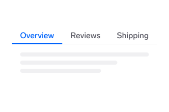
Use one- or two-word nouns. Short labels keep the whole set scannable in a glance.
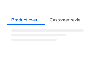
Don't write sentences as labels. They truncate, and a truncated label describes nothing.
Limit the number of tabs
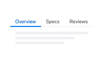
Keep to two to five tabs. Every section stays visible, so people can pick without hunting.
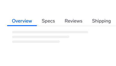
Don't overfill the row. Tabs that run off the edge are effectively invisible — restructure the page or use a Select.
Use tabs for peers, not steps
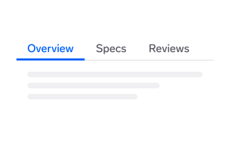
Use tabs when the sections can be read in any order and none depends on another.
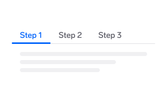
Don't model a sequence with tabs. Use Steps, which shows progress and where the user is in the flow.
Always keep one tab selected
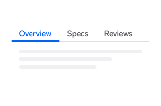
Select a tab on first load and show its panel. Make it the section most people came for.
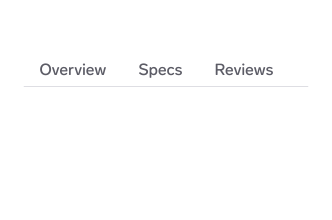
Don't start with nothing selected. An empty panel reads as a broken page rather than a choice.
Keep the set on one line
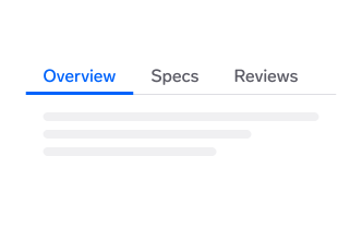
Fit the whole set on one row so it reads as a single control.
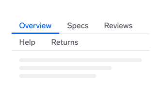
Don't let tabs wrap. A second row looks like a separate control, and the tabs on it get missed.
Don't nest tabs
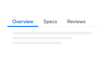
Use one level of tabs. If a panel needs subdivision, use headings or Expandable.
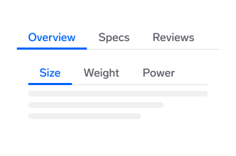
Don't put tabs inside tabs. Two active indicators compete, and it stops being clear which one a click will change.
Use icons consistently
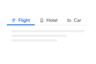
If icons help, give every tab one. The row stays evenly weighted and easy to scan.
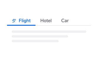
Don't add an icon to some tabs only. The odd one out reads as more important than the rest.
Questions?
Feel free to ask any questions on usage in the Warp DS Slack channel: #warp-design-system