
Snackbar - Overview
Snackbars provide brief, contextual feedback about an operation or system status at the bottom of the screen. They inform users about processes, confirmations, warnings, or errors in a non-intrusive way.
Note: The Toast component is deprecated. Use Snackbar for all toast-style notifications.
See also Alert.
Overview
Snackbars are best suited for providing quick, non-intrusive feedback about actions or system status without interrupting the user's workflow. They appear temporarily at the bottom of the screen and dismiss automatically or via user action.
Use snackbars for success confirmations, process status updates, non-critical warnings, simple errors, or undo actions for destructive operations.
Anatomy
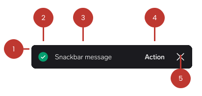
- Container: The background surface that holds all snackbar content.
- Icon (optional): Visual indicator matching the snackbar type (positive, warning, negative, info, neutral).
- Message text: Brief description of the status or action.
- Action button (optional): Interactive element for user response (e.g., "Undo", "Retry", "View").
- Close button (optional): Allows manual dismissal before auto-dismiss timeout.
Example
See more examples on the Elements page.
<w-button data-testid="neutral-action">Neutral variant with action</w-button>

<script>
  document.querySelector('w-button[data-testid="neutral-action"]').onclick =
    () => {
      document.querySelector("w-snackbar").create("Snackbar message", {
        action: {
          label: "Undo",
          onclick(e) {
            console.log(e);
          },
        },
      });
    };
</script>Questions?
Feel free to ask any questions on usage in the Warp DS Slack channel: #warp-design-system