
Checkbox - Overview
Checkboxes allow users to select one or more options from a number of choices.
AndroidreleasedElementsreleasediOSreleasedReactreleasedVuereleased
Checkboxes allow users to toggle an option on or off, or to select one or more items from a list. It typically combines a input (box) with a label that describes the action or choice. They can be used alone or group provide immediate visual feedback, and enhance accessibility when implemented with proper labels, grouping, and states.
Checkboxes can be used alone or in a list (checkbox group).
Related components: Radio, Switch
Example
Anatomy
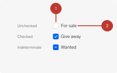
1. Input Indicates the appropriate state. Deselected by default.
2. Label Describes the information you want to select or deselect.
Questions?
Feel free to ask any questions on usage in the Warp DS Slack channel: #warp-design-system