
Tooltip - Overview
A tooltip is a small message box that appears when a user hovers over, focuses, or taps a UI element. It provides brief, supplementary information about that element.
Example
Overview
Tooltips explain what an element does or clarify a term without adding permanent text to the interface. Keep them short — a tooltip is a hint, not a place for instructions.
Use tooltips sparingly. Content inside a tooltip is hidden until the user interacts with the trigger, so anything essential to completing a task belongs in the interface itself.
On the web, Tooltip is a dedicated component. Put the trigger and tooltip next to each other, give the trigger an id, and reference it from the tooltip with for. On iOS and Android, Tooltip is also a dedicated component.
Related components
- Popover — for richer, dismissible content that can include links and actions.
- Callout — for supplementary information that stays visible in the layout.
- Alert — for status, warning, or error messages the user must see.
- Modal — for content that requires the user's full attention and a decision.
Anatomy
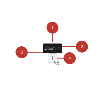
- Container — a floating surface that sits above page content.
- Message — one or two lines of plain text describing the trigger element.
- Arrow — points at the trigger element to show what the message refers to. The arrow appears on the opposite side of the chosen placement. On the web you can remove it with
no-arrow. - Trigger element — the button, icon, or label the tooltip is anchored to. The trigger is not part of the tooltip component itself.
Variants
The tooltip has one variant property: the position of the arrow. Pick the arrow position that points back at the trigger.
The arrow sits on the opposite side to the tooltip's placement. A tooltip placed below its trigger uses the top arrow, because the arrow has to point back up at the trigger.
Arrow top
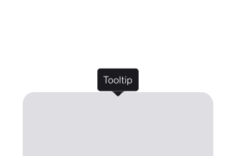
Use when the tooltip sits below the trigger. This is the default placement on web (bottom) and the most common choice, since there's usually room below a control.
Arrow bottom
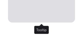
Use when the tooltip sits above the trigger (top placement). Useful when the trigger is near the bottom of the viewport, or when content below it must stay visible.
Arrow left
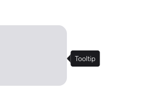
Use when the tooltip sits to the right of the trigger (right placement). Suits triggers in a vertical list, where a top or bottom tooltip would cover the neighbouring rows.
Arrow right
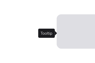
Use when the tooltip sits to the left of the trigger (left placement). Connect the tooltip to its trigger with the trigger's id and the tooltip's for attribute — see Accessibility.
No arrow
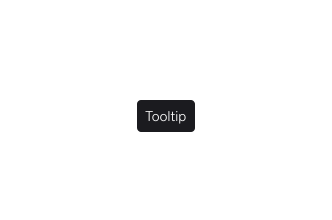
Use only when the connection to the trigger is already obvious — for example, a tooltip pinned directly against a slider handle that moves with it. Without an arrow, nothing points at the trigger, so avoid this variant when several controls sit close together. Set no-arrow on web, and on native omit the arrow edge.
Placement
Tooltips are positioned relative to their trigger.
Web supports four placements: top, bottom, left, and right. The default is top; the tooltip automatically flips to the opposite side and shifts to stay in view.
iOS exposes the arrow edge instead: .top, .leading, .bottom, .trailing, defaulting to .top. Android uses the equivalent Edge.Top, Edge.Bottom, Edge.Leading, and Edge.Trailing.
Staying in view
On the web, the tooltip uses Floating UI to flip and shift automatically when there isn't room for the requested placement. See the Elements page for live examples.
Offsets
Fine-tune the gap between tooltip and trigger with distance (perpendicular offset, default 8) and skidding (offset along the trigger, default 0). On iOS use arrowOffset to shift the arrow away from centre; on Android use horizontalOffset and verticalOffset.
Platform considerations
Web The tooltip is shown on mouseenter and focus, and hidden on mouseleave, blur, and Escape. Associate it with its trigger using for; use open only when visibility must also be controlled programmatically.
iOS/iPadOSWarp.Tooltip renders a SwiftUI view; a UIKit UIView is available via .uiView. There is no hover on touch, so pair the tooltip with a visible tap target of at least 44×44pt.
AndroidWarpTooltip is driven by a WarpTooltipState you toggle from the anchor's click handler. Set inline = true to place the tooltip as a regular composable instead of a popup — useful when you need it in normal layout flow rather than floating above content. Keep anchors at least 48×48dp.
Questions?
Feel free to ask any questions on usage in the Warp DS Slack channel: #warp-design-system