
Radio - Overview
Radio buttons let users select one option from a set of mutually exclusive choices.
See also Checkbox, Select, Switch, and Radio buttons.
Examples
General
Use Radio for a short, visible list where users must choose exactly one option. Selecting a new option replaces the previous selection. This makes the relationship between the choices clear without opening another control.
Radio differs from nearby selection components:
- Use Checkbox when users may select any number of options, including none.
- Use Select when the option list is long or space is limited.
- Use Switch for an independent setting that takes effect immediately.
- Use Radio buttons when the choices need the stronger visual treatment of button-shaped options.
A radio group needs a visible group label and a shared name. Every option also needs a concise label. Help text and an error message belong to the group because the selection rule applies to the choices together.
States
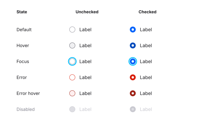
Each option can be checked or unchecked. Interaction and validation add the following states:
- Default: Available for selection and not currently interacted with.
- Hover: The pointer is over the option or its label.
- Focus: The option has keyboard focus. Keep the focus indicator visible.
- Error: The group needs attention, usually because a required choice is missing or invalid.
- Error hover: The invalid option is also under the pointer.
- Disabled: The option cannot be changed. A disabled option can remain visibly selected.
Only one option can be checked within a group. Hover and focus are temporary interaction states; they do not change the selected value by themselves.
Radio group
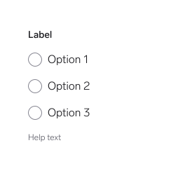
A group combines a label, two or more Radio options, and optional help or error text. Arrange options vertically by default so labels are easy to scan. Horizontal groups are suitable only for a few short, familiar options with enough room at all supported text sizes.
The Web and Android group can begin with no selection. The current iOS RadioGroup API requires a selected option binding, so products that need an initially empty required group must model and test that flow separately on iOS.
Names per platform
The same concepts use different API names across platforms:
| Figma | Web (Elements) | iOS | Android |
|---|---|---|---|
| Checked | checked | isSelected / selectedOption | selected / selectedOption |
| Default | Default properties | .default | enabled = true, isError = false |
| Error | invalid | .error | isError = true |
| Disabled | disabled | .disabled | enabled = false |
Anatomy
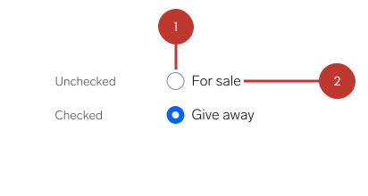
- Radio indicator: Shows whether the option is selected. Only one indicator can be selected within a group.
- Option label: Names the choice and forms part of the option's interactive target.
Questions?
Feel free to ask any questions on usage in the Warp DS Slack channel: #warp-design-system