Combobox (also known as an autocomplete or autosuggest)
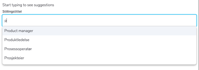
A combobox is the combination of an <input type="text"/> and a list. The list is designed to help the user arrive at a value, but the value does not necessarily have to come from that list. Don't think of it like a <select/>, but more of an input with some suggestions. You can, however, validate that the value comes from the list, that's up to your app.
React
releasedVue
unsupportedElements
unsupportedAndroid
unsupportediOS
unsupportedExample
Usage
Questions?
Feel free to ask any questions on usage in the Warp DS Slack channel: #nmp-warp-design-system
Frameworks
Import
You can import the component like so:
import { Combobox } from '@warp-ds/react';or import it individually to optimize your JS bundle size by adding only the components you need:
import { Combobox } from '@warp-ds/react/components/combobox'Props
Required props
| name | type | default | notes |
|---|---|---|---|
options | ComboboxOption[] | The available options to select from | |
value | string | The TextField input value | |
onChange | (value: string) => void | Called when the value of the input changes |
Optional Props
| name | type | default | notes |
|---|---|---|---|
id | string | Unique identifier for the input field | |
label | string | Label above input | |
placeholder | string | Input placeholder | |
openOnFocus | boolean | false | Whether the popover opens when focus is on the text field |
selectOnBlur | boolean | true | Select active option on blur |
matchTextSegments | boolean | false | Whether the matching text segments in the options should be highlighted. Customise the styling by using CSS selectors to override |
disableStaticFiltering | boolean | false | Disable client-side static filtering |
highlightValueMatch | (optionValue: string, inputValue: string) => ReactNode | Pass your own function for highlight matching | |
invalid | boolean | Renders the input field in an invalid state. Often paired together with | |
helpText | ReactNode | The content to display as the help text | |
className | string | Additional container styling | |
listClassName | string | Additional list styling | |
aria-label | number | Defines a string value that labels the current element. Must be set if | |
aria-labelledby | string | Identifies the element (or elements) that labels the current element. Must be set if | |
children | ReactNode | For Affix use | |
optional | boolean | Mark label to indicate that this combobox is optional. |
Events
| name | when | ||
|---|---|---|---|
onSelect | ((value: string) => void) & ReactEventHandler | Called when the user selects an option | |
onFocus | (() => void) & FocusEventHandler | Called when the input is focus | |
onBlur | ((value: string) => void) & FocusEventHandler | Called when the input loses focus with the current navigation value or input value |
export type ComboboxOption = {
  value: string;
  label?: string;
};
Example
function Example() {
  const [value, setValue] = useState('');

  return (
    <Combobox
      label="Choose a fruit"
      value={value}
      onChange={(val) => setValue(val)}
      onSelect={(val) => setValue(val)}
      options={[
        { value: 'Apple' },
        { value: 'Banana' },
        { value: 'Orange' },
        { value: 'Pineapple' },
      ]}
    />
  );
}
Highlight matched text segments
If you want to highlight the matched text you can set the matchTextSegments prop.
function Example() {
  const [value, setValue] = useState('');

  return (
    <Combobox
      label="Choose a fruit"
      value={value}
      onChange={(val) => setValue(val)}
      onSelect={(val) => setValue(val)}
      matchTextSegments
      options={[
        { value: 'Apple' },
        { value: 'Banana' },
        { value: 'Orange' },
        { value: 'Pineapple' },
      ]}
    />
  );
}
Note that this prop only enables the component's default styling for text matches. You can style text matches however you'd like by overriding styles on [data-combobox-text-match]. For example:
[data-combobox-text-match] {
  background: yellow;
}
The matchTextSegments uses the default algorithm for input/option matching. To write your own matching algorithm, pass a function to the highlightValueMatch prop. In most cases you won't have to alter this.
// PSEUDO CODE
function highlightValueMatch(optionValue: string, inputValue: string) {
  // ADDITIONAL CODE?
  if (match) ;// return JSX string value with additional visual styling
  else ;// return JSX string value
}
Asynchronous option fetching
When you fetch options asynchronously, it is often preferred to pass the disableStaticFiltering prop so that you don't filter the options client side.
Custom rendering in ComboboxOption
Sometimes you need to render something other than the value as the visible option, in these cases you can pass a label. The label is only for display. The value is what gets sent back when selected.
function Example() {
  const [value, setValue] = useState('');

  return (
    <Combobox
      label="Choose a fruit"
      placeholder="Custom Option Rendering"
      value={value}
      onChange={(val) => setValue(val)}
      onSelect={(val) => setValue(val)}
      matchTextSegments
      options={[
        { value: 'Apple', label: '🍎 Apple' },
        { value: 'Banana', label: '🍌 Banana' },
        { value: 'Orange', label: '🍊 Orange' },
        { value: 'Pineapple', label: '🍍 Pineapple' },
      ]}
    />
  );
}
Client side search
This example searches an API of Star Wars characters. Combobox does not implement any matching on your list (aside from highlighting the matched phrases in an option). Instead, you render an option for each result you want in the list. So your job is to:
- Establish the search term state
- Match the search to your list
- Render an option for each match There is nothing special about managing state for a combobox, it's like managing state for any other list in your app. As the input changes, you figure out what state you need, then render as many options as you want.
function Example() {
  const [value, setValue] = React.useState('');
  const characters = useDebouncedSearch(value, 300);

  // Generic debouncer
  function useDebouncedSearch(query, delay) {
    const [characters, setCharacters] = React.useState([]);

    React.useEffect(() => {
      if (!query.length) setCharacters([]);

      const handler = setTimeout(() => {
        fetch('https://swapi.dev/api/people/?search=' + query.trim())
          .then((res) => res.json())
          .then((res) => {
            console.log('Results from API', query);
            setCharacters(res.results.map((c) => ({ value: c.name })));
          });
      }, delay);

      return () => {
        clearTimeout(handler);
      };
    }, [query]);

    return characters;
  }

  return (
    <Combobox
      label="Star Wars character"
      disableStaticFiltering
      matchTextSegments
      openOnFocus
      value={value}
      onChange={(val) => {
        setValue(val);
      }}
      onSelect={(val) => {
        setValue(val);
        action('select')(val);
      }}
      options={characters}
    >
      <Affix
        suffix
        clear
        aria-label="Clear text"
        onClick={() => {
          setValue('');
        }}
      />
    </Combobox>
  );
}
Affix
If you wish to use an affix you must first import the Affix component.
import { Affix } from '@warp-ds/react';Then you include it as a child of Combobox component and pass the appropriate props (see bottom of this page for types).
function Example() {
  const [value, setValue] = useState('');

  return (
    <Combobox
      label="Choose a fruit"
      placeholder="Your favorite fruit"
      value={value}
      onChange={(val) => setValue(val)}
      onSelect={(val) => setValue(val)}
      matchTextSegments
      options={[
        { value: 'Apple', label: '🍎 Apple' },
        { value: 'Banana', label: '🍌 Banana' },
        { value: 'Orange', label: '🍊 Orange' },
        { value: 'Pineapple', label: '🍍 Pineapple' },
      ]}
    >
      <Affix
        suffix
        clear
        aria-label="Clear text"
        onClick={() => setValue('')}
      />
    </Combobox>
  );
}
Note that when using the Affix component without a label you should specify an aria-label. See props at the bottom of this page. See TextField for more details on Affix.
Affix props
| name | type | default | notes |
|---|---|---|---|
aria-label | string | Defines a string value that labels the affix element | |
prefix | boolean | Affix added at the beginning of input | |
suffix | boolean | Affix added at the end of input | |
clear | boolean | Displays a clear icon | |
search | boolean | Displays a search icon | |
label | string | Displays a string |
Events
| name | when | ||
|---|---|---|---|
onClick | () => void | Click handler paired with clear or search |
Clearing input on select
If you want, you can have the input field cleared after a value has been selected:
function Example() {
  const [value, setValue] = useState('');

  return (
    <Combobox
      label="Choose a fruit"
      value={value}
      onChange={(val) => setValue(val)}
      onSelect={(val) => {
        alert(val);
        setValue('');
      }}
      options={[
        { value: 'Apple' },
        { value: 'Banana' },
        { value: 'Orange' },
        { value: 'Pineapple' },
      ]}
    />
  );
}
Optional prop
Add the optional prop to indicate that the combobox field is not required.
function Example() {
  const [value, setValue] = useState('');

  return (
    <Combobox
      label="Choose a fruit"
      optional
      value={value}
      onChange={(val) => setValue(val)}
      onSelect={(val) => {
        alert(val);
        setValue('');
      }}
      options={[
        { value: 'Apple' },
        { value: 'Banana' },
        { value: 'Orange' },
        { value: 'Pineapple' },
      ]}
    />
  );
}