Get started with Web-Components for Web developers
Warp Elements are published to and delivered by our CDN server, Eik. You do not need to install @warp-ds/elements to use the components, and you should not bundle the components into your client-side application code.
If you want better DX (types, intellisense, and docs in editors), you can install @warp-ds/elements locally and use it alongside the Web Components Language Server extension for VS Code.
Setup
Included in Borealis
All Borealis apps include the Warp Design System fonts, brand tokens (CSS variables), CSS reset, and component CSS (specifically, via the shared HTML template).
Unless you do something custom in your apps, as long as you use Huck or Borealis layout and podlet modules, you are ready to use Warp.
Setup yourself
Add the Warp script and stylesheet to the document head so it loads early:
<link rel="stylesheet" href="https://assets.finn.no/pkg/@warp-ds/elements/v2/styles.css" crossorigin />
<script type="module" src="https://assets.finn.no/pkg/@warp-ds/elements/v2/index.js" crossorigin></script>
Editor integration
For improved integration with your editor, install the Warp packages as development dependencies and set up these extensions (or equivalent for your editor):
- Web Components Language Server for hover info and code completion for Warp components.
- UnoCSS for hover info and code completion for Warp CSS classes.
- Lit for syntax highlighting and code completion in Lit components.
Install Warp packages
TIP
These are already set up for you when you use the Backstage templates.
For improved editor integration you should have Warp packages installed, so the tooling can process and show Warp documentation.
npm install -D @warp-ds/elementspnpm add -D @warp-ds/elementsThe Web Components Language Server will automatically provide documentation on hover and code completions whenever you use Warp Elements, even in other frameworks such as React.
A web components base
The direction Warp is going is to have the Elements (web components) implementation as the source for all other components.
import React from "react";
// No import of `@warp-ds/elements` necessary, it's globally available on Aurora

export const Page = ({ title, children }) => {
	return (
		<main className="main-wrapper">
			<div className="p-16">
				<w-breadcrumbs>
					<a href="/">Tori</a>
					<span aria-current="page">{title}</span>
				</w-breadcrumbs>
			</div>
			<div className="relative w-full max-w-[1440] mx-auto px-16">
				<div className="mx-auto max-w-8xl mb-20">
          {children}
				</div>
			</div>
		</main>
	);
};
Basing the design system implementation on web components is a strategy to avoid lock-in and give teams autonomy. Since web components can work anywhere, a design system built on web components doesn't place constraints on a team's choice of view layer.
Framework wrappers
Framework specific wrappers provide a layer of syntactic sugar for developer experience, for those who prefer.
The framework wrappers can make the Warp components look and feel more like components you write yourself, but there are benefits to using the Warp web components directly:
- The API for the components will be the same in any codebase you work on, regardless of tech stack.
- It's closer to the guidelines of HTML first
- It's clear when looking at the code that the implementation is based on web components.
React (v19+)
React 19+ supports custom elements directly. Make sure the Warp assets are loaded in the document head as described above, then use the elements in JSX.
export function Example() {
  const handleClick = () => {
    toast({ title: 'Saved', description: 'Your changes are live.' });
  };

  return (
    <section>
      <w-badge variant="neutral">New</w-badge>
      <w-button variant="primary" onClick={handleClick}>
        Continue
      </w-button>
    </section>
  );
}
Any event that the component emits, can be used in React by prefixing it with "on".
Avoid FOUC with Warp cloaking
To avoid flash-of-unstyled-content and cumulative layout shift issues, wrap your page content in a warp-cloak container. The cloak is removed automatically once Warp is ready.
<div class="warp-cloak">
<main>
<!-- Your app -->
</main>
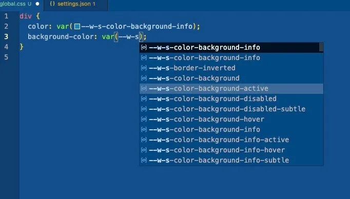
</div>Set up CSS variables IntelliSense
For when you want to use Warp semantic CSS variables, install CSS Variable Autocomplete.
Once you add brand token files to lookupFiles you should see Warp CSS variables as code suggestions when writing CSS var(--w-s).
// settings.json
{
  "cssVariables.lookupFiles": [
    "**/*.css",
    "**/*.scss",
    "**/*.sass",
    "**/*.less",
    "node_modules/@warp-ds/css/dist/tokens/finn-no.css"
 ]
}