Dark mode
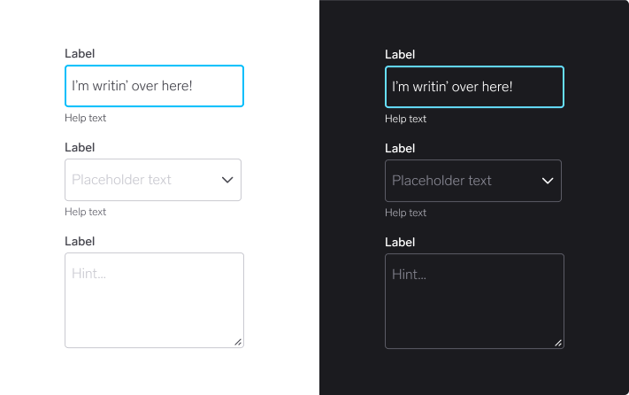
WARP offers light and dark mode for all supported brands
Support in WARP
All components and tokens in WARP are built with dark mode in mind. Therefore there’s not much you need to consider when creating your designs.

For designers
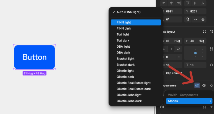
Switching modes
You can switch to dark mode whenever you want, either for a specific component or an entire frame. This is available in the right sidebar.
It’s always a good idea to see what your designs look like in dark mode to make sure colour contrasts are good enough and that illustrations and graphics are optimised for a darker setting.
