
Elevation
Elevation is the distance between two surfaces on the z-axis. We use it to create depth in our visual hierarchy and to help highlight important information or interactivity.
The basics
The main focus of elevation is to provide a clear contrast between surfaces and their surroundings. We use visual planes, or spatial layers, to help create depth within the UI to give us an extra dimension in our visual hierarchy that we can use to differentiate between information.
If you think of the UI as a flat surface, elevation allows us to build above, or below, that surface. That means that we can make objects or elements stand out, or interrupt the visual flow when needed.

Why use elevation?
Depth
Elevation can be used to add an extra 3-dimensional level to our visual hierarchy, making objects appear closer to, or further away from, the user. It can be used to give the affordance of click-ability (eg. cards), provide a necessary interruption or interjection, (eg. a modal) or to provide information where there isn’t any space to do so (eg. Tooltip, Popover).
Readability
By adjusting the elevation of elements such as boxes, popovers or tooltips, designers can ensure that important content stands out, or demands focus, against the background, improving readability.
Consistency
By defining elevation tokens as part of a design system, consistency can be maintained across different components and screens of an application. Designers can easily switch between light and dark modes without needing to redefine elevation values, streamlining the design process and ensuring a cohesive user experience.
Surface types
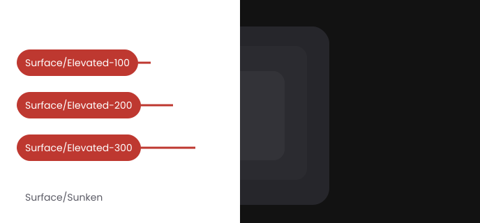
There are four surface types that represent the different levels in our elevation system. These take into consideration where in the hierarchical levels the surface fits and how it interacts with the other levels.
Elevated-300
The highest elevation, used for things that need to be separated from all other surfaces, eg. popover, menu and dropdown. Uses the large shadow.
Elevated-200
Used for interactive elements, like cards, that are slightly raised from the surface they’re sitting on (which could be a standard background or an elevated surface such as a modal).
Elevated-100
Used for larger surface areas like modals and drawers. Uses the medium shadow.
Default canvas layer
The layer between elevated-100 and sunken is the default canvas layer. Use regular background tokens here.
Sunken
The lowest elevation that represents a layer beneath the default canvas surface layer and can be used as a backdrop for content. Use only below the default canvas layer and never on top of any of the elevated surfaces.
Dark mode
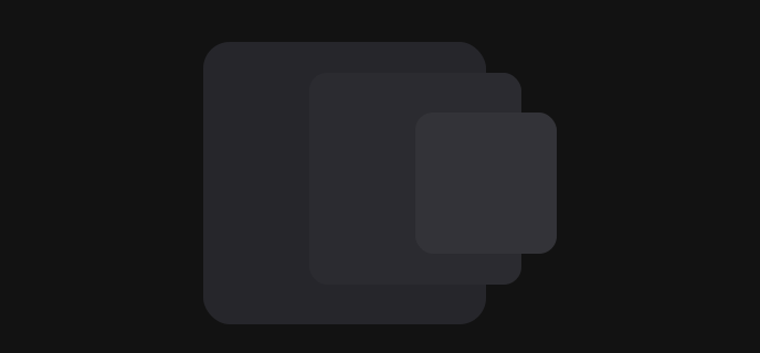
In dark mode, where shadows are less visible, we add subtle differences in colour to each of our elevated surface tokens to accentuate the difference in the perceived height of the levels. By making each surface token lighter the further away it gets from the “ground” (default canvas level), it gives an added level of separation between surfaces, making sure that each element has good enough contrast when used in combination with other surfaces.
Shadows
Shadows can express the degree of elevation between surfaces in ways that other techniques can't.
We use shadows along with elevation tokens to show visual depth and give the affordance of click-ability. Both a shadow’s size and amount of softness or diffusion express the degree of distance between two surfaces. The smaller the shadow, the closer the object or element is to the default surface whilst large shadows give the effect of an object being higher above the surface, or closer to the eye of the viewer.
We have various shadow styles that we use for specific use-cases.
Small

shadow-small
Use for:
- Card default state
- Low-level clickable items
We use two shadows to achieve the desired effect:
| X | Y | Blur | Spread | Colour | Opacity |
|---|---|---|---|---|---|
| 0 | 1 | 6 | 0 | #000000 | 12% |
| 0 | 1 | 1 | 0 | #000000 | 16% |
Medium

shadow-medium
Use for:
- Card hover state
- Low-level clickable items hover state
- Tooltip
- Callout popover
We use two shadows to achieve the desired effect:
| X | Y | Blur | Spread | Colour | Opacity |
|---|---|---|---|---|---|
| 0 | 3 | 6 | 0 | #000000 | 10% |
| 0 | 3 | 8 | 0 | #000000 | 16% |
Large

shadow-large
Use for:
- Modal
- Popover
- Datepicker
- Snackbar
We use two shadows to achieve the desired effect:
| X | Y | Blur | Spread | Colour | Opacity |
|---|---|---|---|---|---|
| 0 | 6 | 12 | 0 | #000000 | 20% |
| 0 | 10 | 20 | 0 | #000000 | 10% |
X-Large

shadow-xlarge
Use for:
- Not currently used
We use two shadows to achieve the desired effect:
| X | Y | Blur | Spread | Colour | Opacity |
|---|---|---|---|---|---|
| 0 | 9 | 18 | 0 | #000000 | 10% |
| 0 | 14 | 28 | 0 | #000000 | 20% |