Chart Colors (dataviz)
For implementation, see Tokens & CSS > Chart Colors.
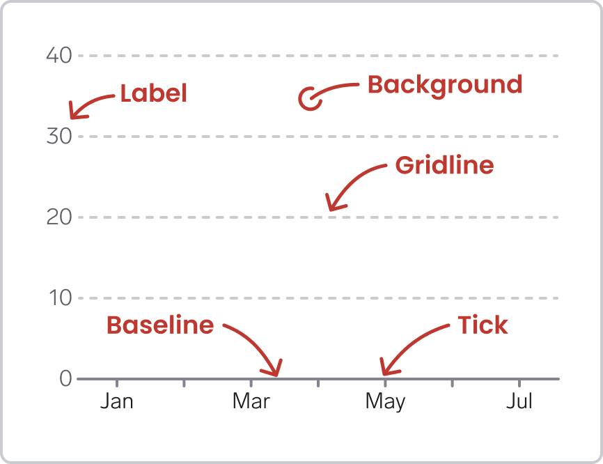
Chart colors are colors that we use to build non-data element in the chart, such as:
- The background: a surface for all chart elements, to ensure good contrast
- The baseline, long line, typically indicating 0 on the y axis
- Gridlines. long lines at regular intervals on the x or y axis
- Ticks: short lines indicating regular intervals on the x or y axis
- Labels: text on the x or y axis, often next to ticks or gridlines
Semantic chart colors
All chart colors start with Chart-.
Which chart elements do you need?
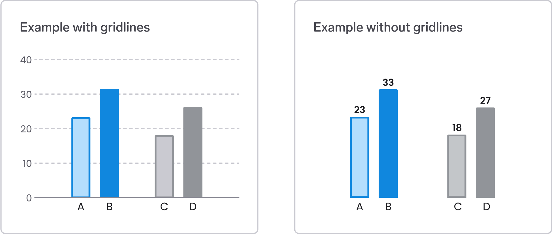
You don't necessarily need to include all chart elements in every graph. Less is more – consider what is needed in the particular use case.
Things to consider:
- Gridlines combined with labels (example to the left) make it possible to see the approximate value of the data mark (for example a bar), and can be useful if there are many data marks in the graph
- If there are few data marks in the graph, you could consider showing the value for each data mark (example to the right). In that case, you don't really need the gridlines and value labels on the axes
- The baseline is useful to ground the visual marks and connect all the elements together. Especially when using lines and points it is necessary to have a baseline to be able to visually see the distance from 0 to the visual marks. However, for a bar chart or area chart it might be ok to skip the baseline, as long as the data marks are not too far from each other.
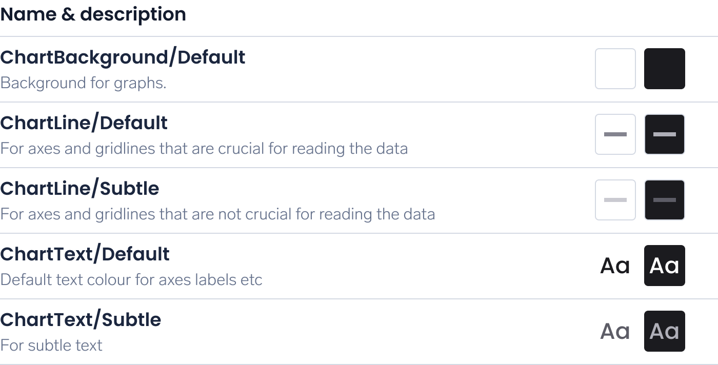
Which chart colors should you use?
The semantic colors to use for different chart elements:
| Element | Semantic color |
|---|---|
| Background | ChartBackground/Default |
| The baseline | ChartLine/Default |
| Gridlines | ChartLine/Subtle |
| Ticks | ChartLine/Default |
| Labels | ChartText/Default or ChartText/Subtle |
To achieve sufficient contrast, visualizations should always be placed on ChartBackground, which corresponds to the default background color in WARP.
ChartLine
For lines, choose color based on the importance of the line.
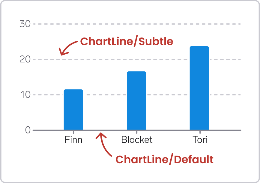
The baseline is often crucial to interpret the data values, especially in line charts and scatter plots. The gridlines are not that crucial. Therefore, the baseline should typically use ChartLine/Default color, while the gridlines use the ChartLine/Subtle color.
ChartText
For text, choose color based on the importance of the text.
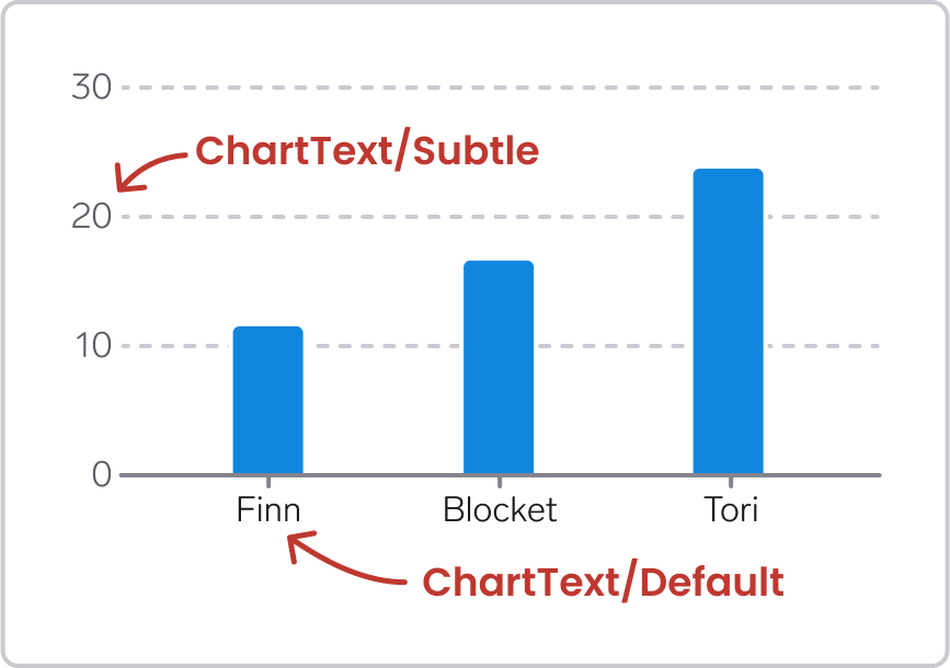
For example, in the bar chart above, it is more important to identify what each bar represents, than value labels on the y axis. The chart would still make sense without the y axis labels, but not without the x axis labels. Therefore, the labels on the x axis use the ChartText/Default color, while the labels on the y axis use the ChartText/Subtle color.