Data Colors (dataviz)
For implementation, see Tokens & CSS.
On this page:
Semantic data colors for dataviz
For data colors, there are different semantic colors that should be used intentionally: Primary, Secondary, Category and Evaluation colors.
In dataviz we use visual elements to encode data (sometimes referred to as ‘data marks’).
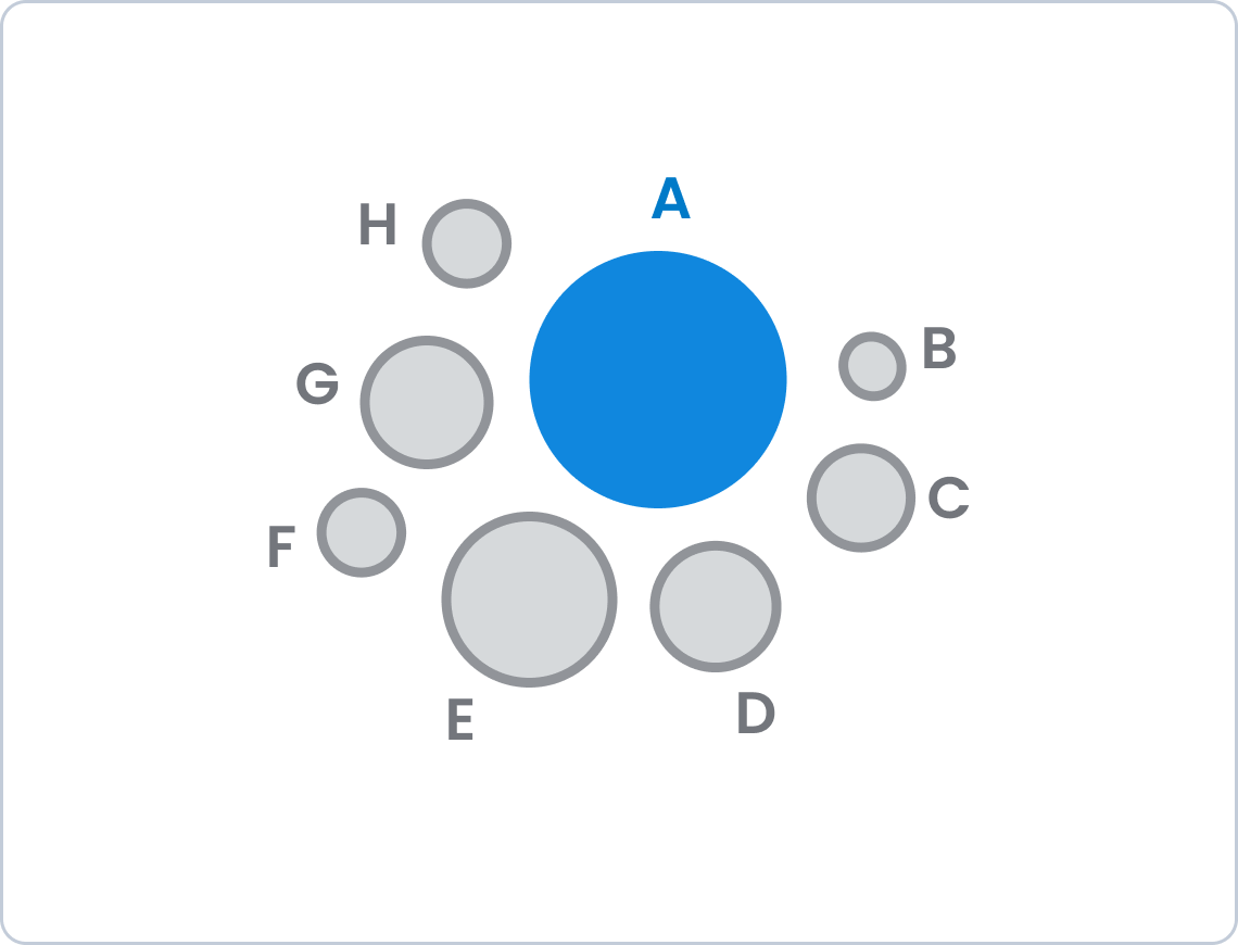
Primary – when you only need one color
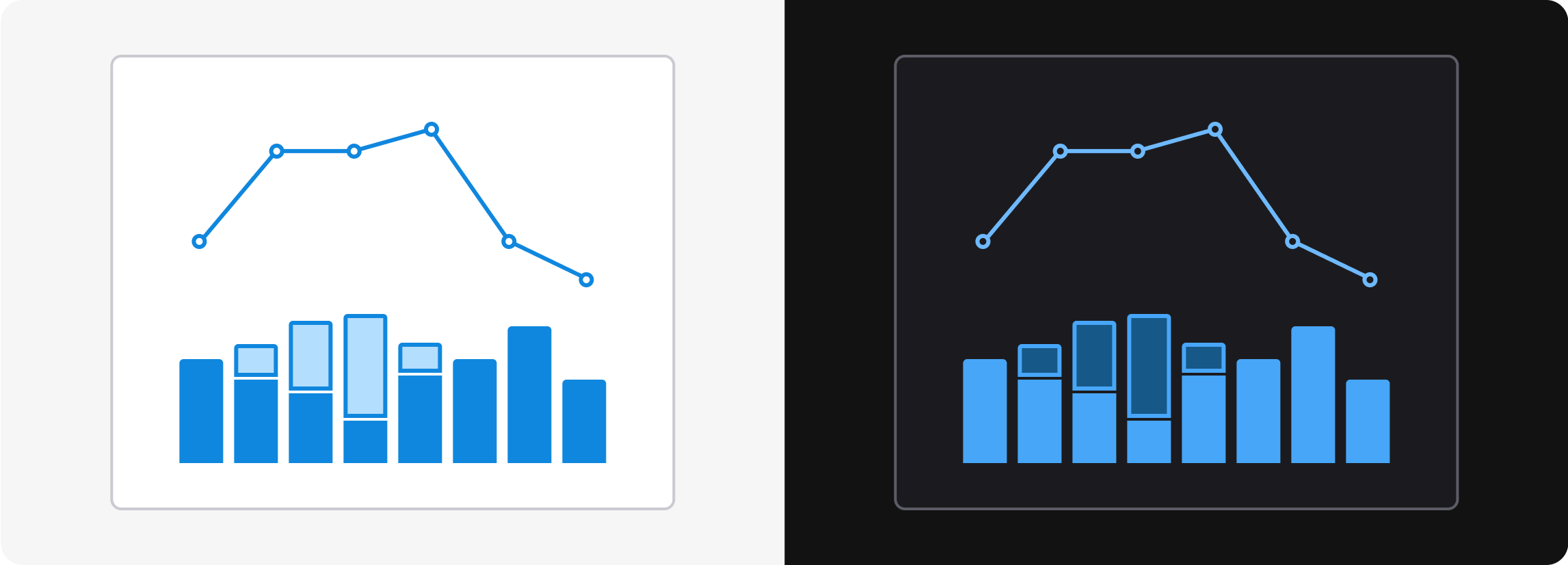
If you only need one color (or hue) in a chart, use the Primary color. The primary color is blue, but the shade varies across light mode, dark mode and the it is applied to.
By using the primary color across multiple graphs, our pages get a consistent and professional look and feel.
Primary: Blue
| Name | Light/Dark mode | Description |
|---|---|---|
Background/Primary |  | Bars and areas |
Background/Primary-Subtle |  | Subtle color for bars and areas |
Line/Primary |  | Lines and points |
Border/Primary |  | Border around -Subtle |
Text/Primary |  | Text |
Icon/Primary | Icons |
Secondary – for secondary information
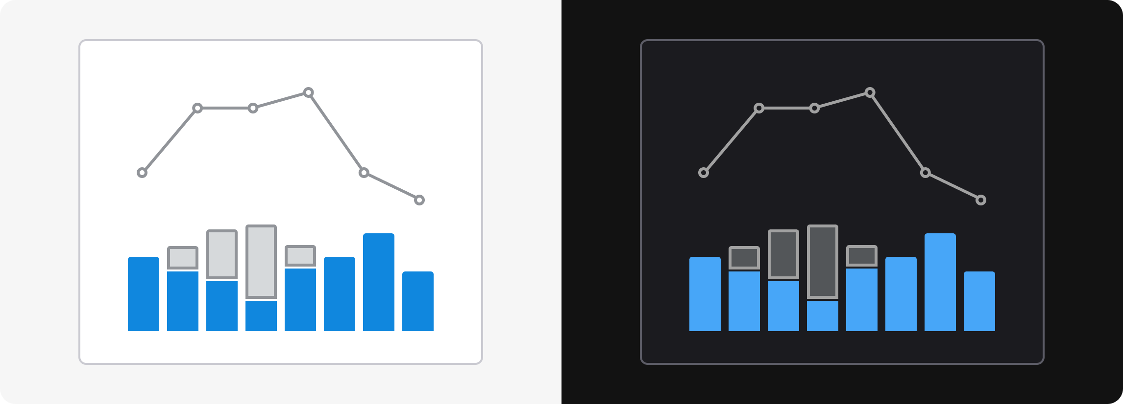
When you want to indicate that a data category is secondary, you may use the secondary color. The primary color is gray.
The secondary color can be useful if you want to compare some important data with reference data, for example this year against last year, or your own performance against others’.
In general the Secondary color should be used together with the Primary color, and it doesn’t make much sense to use the Secondary color alone.
Secondary: Gray
| Name | Light/Dark mode | Description |
|---|---|---|
Background/Secondary |  | Bars and areas |
Background/Secondary-Subtle |  | Subtle color for bars and areas |
Line/Secondary |  | Lines and points |
Border/Secondary |  | Border around -Subtle |
Text/Secondary |  | Text |
Icon/Secondary | Icons |
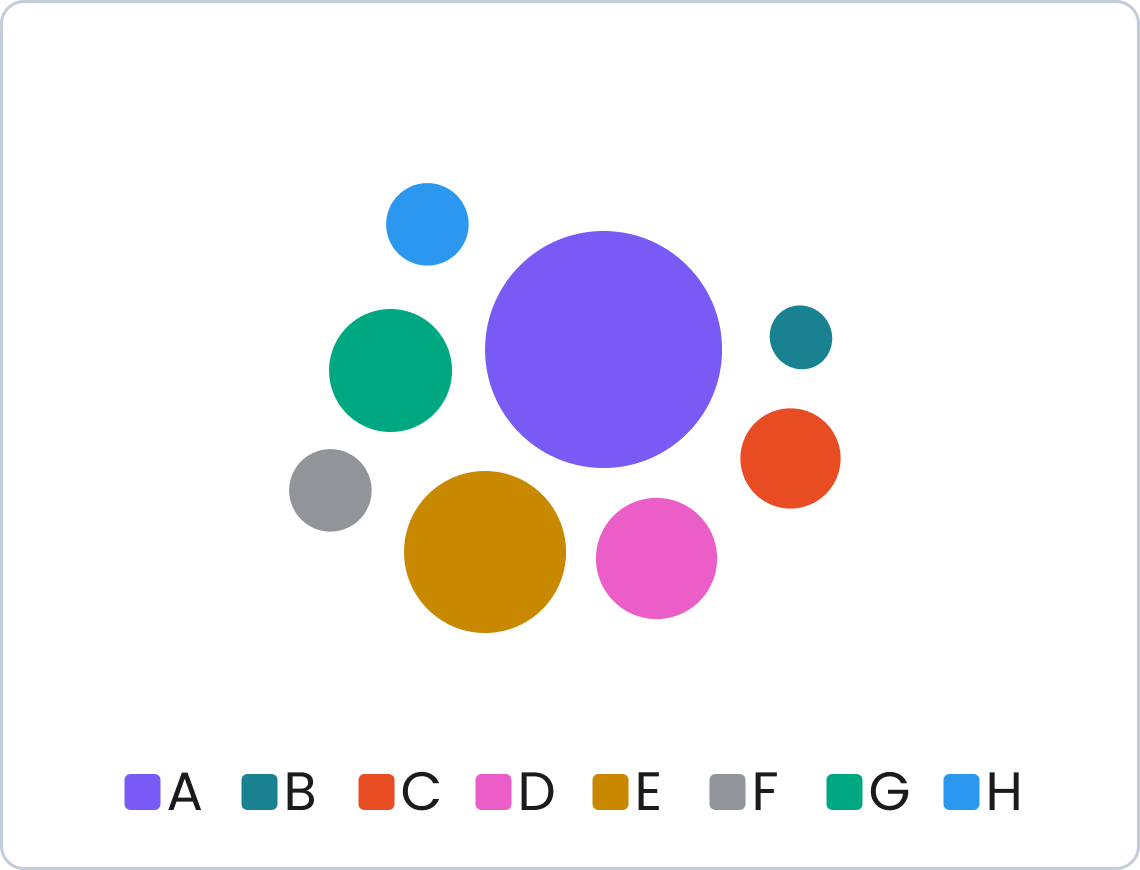
Category – to differentiate between categories
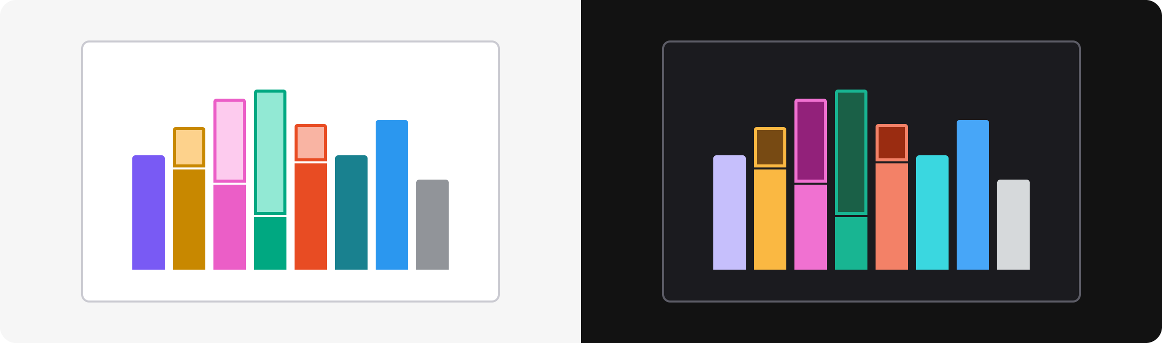
There are 8 category colors to indicate different categories of data: indigo, yellow, pink, green, orange, teal, blue and gray.
The category colors are suited for “nominal data” – which means data that represents different categories without any inherent order. In other words: things that are of equal importance. Examples: different brands, verticals, countries or product types.
Category1: Indigo
| Name | Light/Dark mode | Description |
|---|---|---|
Background/Category1 |  | Bars and areas |
Background/Category1-Subtle |  | Subtle color for bars and areas |
Line/Category1 |  | Lines and points |
Border/Category1 |  | Border around -Subtle |
Text/Category1 |  | Text |
Icon/Category1 | Icons |
Category2: Yellow
| Name | Light/Dark mode | Description |
|---|---|---|
Background/Category2 |  | Bars and areas |
Background/Category2-Subtle |  | Subtle color for bars and areas |
Line/Category2 |  | Lines and points |
Border/Category2 |  | Border around -Subtle |
Text/Category2 |  | Text |
Icon/Category2 | Icons |
Category3: Pink
| Name | Light/Dark mode | Description |
|---|---|---|
Background/Category3 |  | Bars and areas |
Background/Category3-Subtle |  | Subtle color for bars and areas |
Line/Category3 |  | Lines and points |
Border/Category3 |  | Border around -Subtle |
Text/Category3 |  | Text |
Icon/Category3 | Icons |
Category4: Green
| Name | Light/Dark mode | Description |
|---|---|---|
Background/Category4 |  | Bars and areas |
Background/Category4-Subtle |  | Subtle color for bars and areas |
Line/Category4 |  | Lines and points |
Border/Category4 |  | Border around -Subtle |
Text/Category4 |  | Text |
Icon/Category4 | Icons |
Category5: Orange
| Name | Light/Dark mode | Description |
|---|---|---|
Background/Category5 |  | Bars and areas |
Background/Category5-Subtle |  | Subtle color for bars and areas |
Line/Category5 |  | Lines and points |
Border/Category5 |  | Border around -Subtle |
Text/Category5 |  | Text |
Icon/Category5 | Icons |
Category6: Teal
| Name | Light/Dark mode | Description |
|---|---|---|
Background/Category6 |  | Bars and areas |
Background/Category6-Subtle |  | Subtle color for bars and areas |
Line/Category6 |  | Lines and points |
Border/Category6 |  | Border around -Subtle |
Text/Category6 |  | Text |
Icon/Category6 | Icons |
Category7: Blue
| Name | Light/Dark mode | Description |
|---|---|---|
Background/Category7 |  | Bars and areas |
Background/Category7-Subtle |  | Subtle color for bars and areas |
Line/Category7 |  | Lines and points |
Border/Category7 |  | Border around -Subtle |
Text/Category7 |  | Text |
Icon/Category7 | Icons |
Category8: Gray
| Name | Light/Dark mode | Description |
|---|---|---|
Background/Category8 |  | Bars and areas |
Background/Category8-Subtle |  | Subtle color for bars and areas |
Line/Category8 |  | Lines and points |
Border/Category8 |  | Border around -Subtle |
Text/Category8 |  | Text |
Icon/Category8 | Icons |
Evaluation - to indicate something positive, neutral or negative
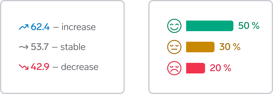
Use evaluation colors when you need the colors to indicate if the data is positive or negative for the intended user in a specific use case. The semantic options are:
- Positive (green) to indicate positive data, such as increase in sales or engagement, or the effect of using a product or service. You can also use the Primary color (blue) to indicate something positive
- Warning (yellow) to indicate data that need attention or may soon encounter problems
- Negative (red) to indicate negative data, such as decrease in sales or engagement
- Neutral (grey) to indicate baseline or standard data next to positive or negative data.
How can red and green work for people with color deficiencies?
Green and red are well established colors for indicating positive or negative values. However, this color combination is particularly challenging for people with color deficiencies. We have tried to find shades of red and green that can work for many with color deficiencies, but the colors will not be possible to differentiate for everyone.
What you can do to make the colors work for everyone:
- Make sure to use something in addition to color to indicate the value, for example an icon or text. Think that the visualization should make sense even if it was printed in black and white. See illustration above for an example.
- Use the Primary color (blue) instead of Positive (green). Blue and red is a safer combination than green and red
- Use areas and bars rather than lines. It is easier for people to differentiate colors for large areas than for small elements
- Combine a background color with a background-subtle color, for example
Background/PositivewithBackground/Negative-Subtle
What is positive or negative for the user depends on the context. Sometimes it is positive that a number goes up, sometimes it is positive that it goes down. Sometimes it is positive that a value is low or high, other times it is more important if the trend is going up or down.
Positive: Green
| Name | Light/Dark mode | Description |
|---|---|---|
Background/Positive |  | Bars and areas |
Background/Positive-Subtle |  | Subtle color for bars and areas |
Line/Positive |  | Lines and points |
Border/Positive |  | Border around -Subtle |
Text/Positive |  | Text |
Icon/Positive | Icons |
Warning: Yellow
| Name | Light/Dark mode | Description |
|---|---|---|
Background/Warning |  | Bars and areas |
Background/Warning-Subtle |  | Subtle color for bars and areas |
Line/Warning |  | Lines and points |
Border/Warning |  | Border around -Subtle |
Text/Warning |  | Text |
Icon/Warning | Icons |
Negative: Red
| Name | Light/Dark mode | Description |
|---|---|---|
Background/Negative |  | Bars and areas |
Background/Negative-Subtle |  | Subtle color for bars and areas |
Line/Negative |  | Lines and points |
Border/Negative |  | Border around -Subtle |
Text/Negative |  | Text |
Icon/Negative | Icons |
Neutral: Gray
| Name | Light/Dark mode | Description |
|---|---|---|
Background/Neutral |  | Bars and areas |
Background/Neutral-Subtle |  | Subtle color for bars and areas |
Line/Neutral |  | Lines and points |
Border/Neutral |  | Border around -Subtle |
Text/Neutral |  | Text |
Icon/Neutral | Icons |
Color guidelines
Don't use color alone to differentiate between categories
Do
Don't
See visual success criteria nr. 1: Don’t rely on color alone to explain data.
Consider the order of categorical colors
The colors don’t have to be applied in any particular order, and all combinations of categorical colors should work reasonably well. However, randomly choosing colors can have some negative consequences.
If you choose to not follow the order of color in the library, consider this:
- Avoid using orange unless there are already many other categorical colors in use, as orange alone can easily be perceived as negative. In particular, avoid orange together with green or teal. Use the evaluation colors if the intension is to indicate something good or bad
- If possible, only use orange if the graph already includes pink. This reduces the risk of interpreting orange as negative
- Only use blue and grey from the category palette when many other colors are in use. Otherwise the information can wrongly be interpreted as primary and secondary.
If you use the order of the colors in the library, you don’t have to think about these issues.
Be careful using category colors for specific data types
It is possible to use Category colors in a way that makes it easier for users to recognise specific types of data or differentiate between graphs. For example, in Mobility you could always use specific colors to represent cars running on petrol, diesel or electricity. This is especially useful if there are several graphs in a view that share the same data types. In addition, using different colors for different data types and graphs can make it easier for people to recognise and differentiate between the graphs.
However, be aware of some potential issues with this approach:
- You will run out of colors!
- If there are many graphs with many different colors in a view, the result might become chaotic and overwhelming, thereby appear less professional and trustful
- There will be inconsistencies across verticals (and even between services within a vertical) as it is impossible to have enough colors for all data options.