Chart Components
On this page:
Components in Figma
Chart examples
In the Dataviz library in Figma you will find a range of graph examples that are built using the dataviz color palette and the sub-components in the library. The examples are published as components, and can therefore easily be added to your sketches.
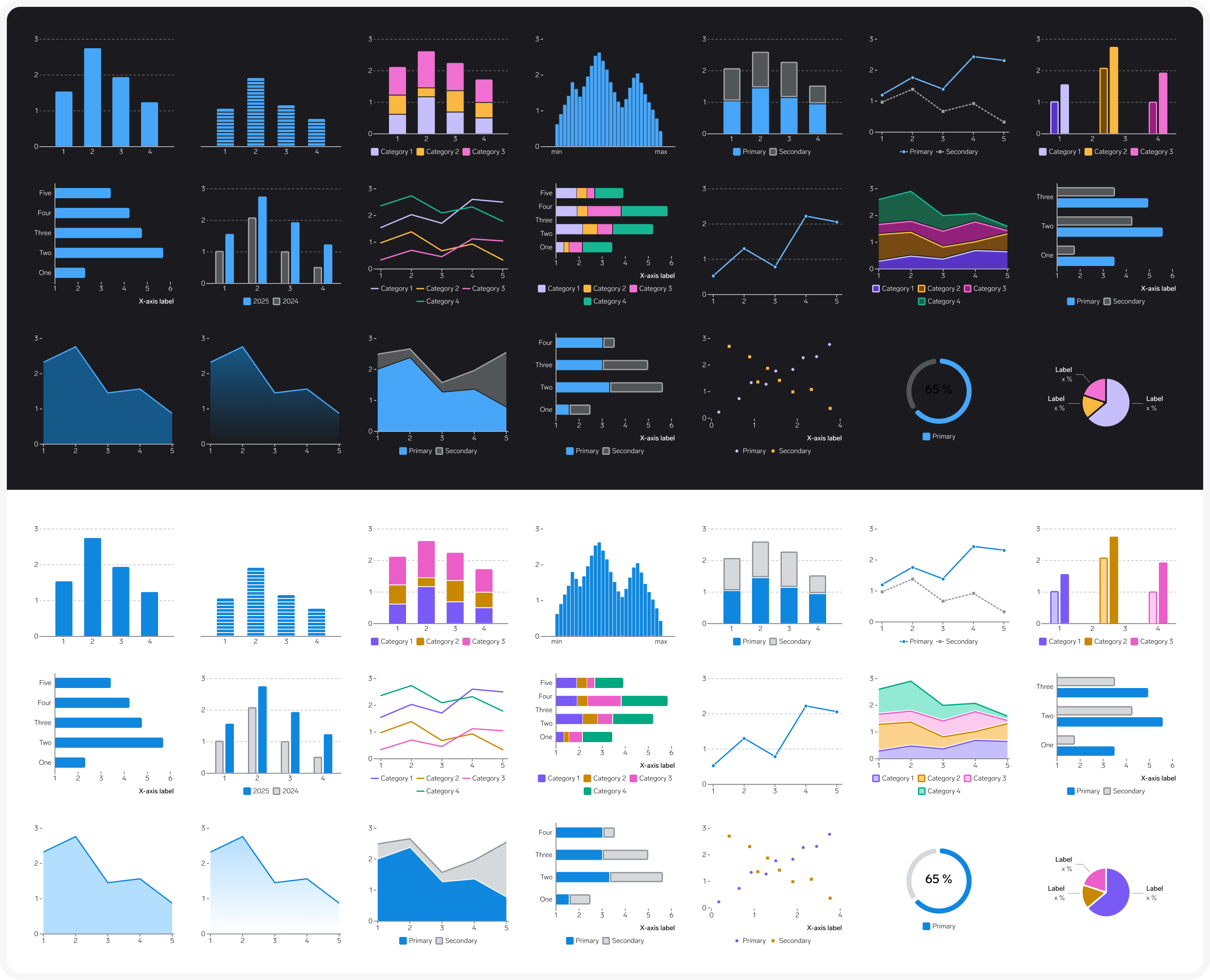
Many of the chart examples have variants, for example showing how hover state can look like. The example charts are 328 px wide to work well on mobile, but are fully responsive.
Sub-components
A chart is made up of a range of elements that are are available as components in Figma.
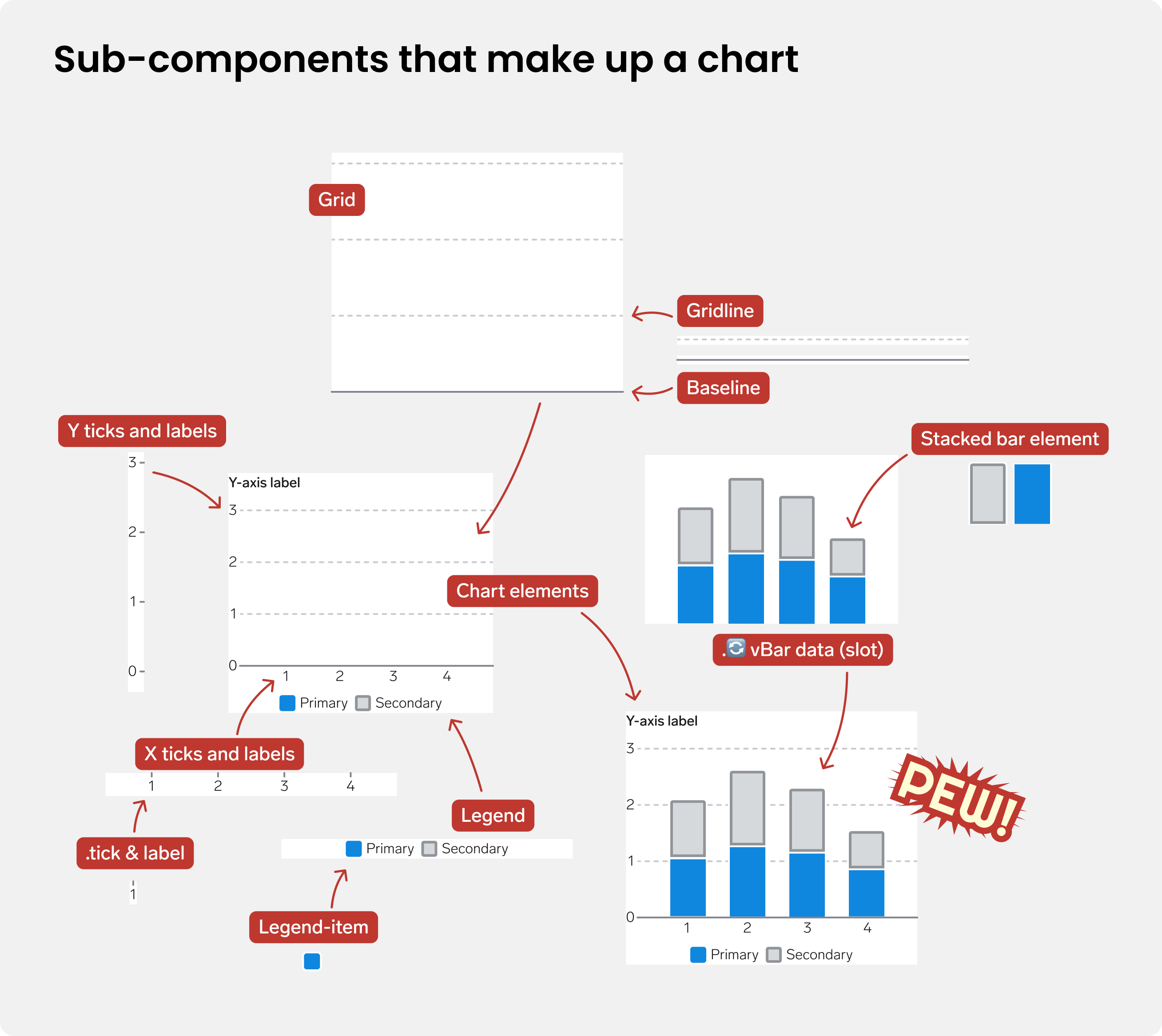
Sub-components include:
- A
Gridcomponent with aGridlineand aBaselinecomponents inside. Choose number of lines, orientation (Horizontal / Vertical), and show/hide baseline - A
Ticks & Labelscomponent. Choose number of ticks, and which side of the graph the ticks should be placed (below or left). For each tick the label and visual tick can be turned on or off individually. For example, you might want to have a label for every second tick - A
Legendcomponent withLegend-itemcomponents inside. Choose Chart type (Bar/area, Line, Point), Colors (Primary & Secondary, Category, Evaluation) and how many items to show.
These sup-components are available as components in the Figma library. Note that these components do not exist in code, as graphs are typically created using various libraries, and are therefore not composed in the same way.
Chart component with slot
What is a slot?
In Figma, a "slot" is a designated area within a component where you can insert other components or UI elements without detaching the component.
The sub-components listed above are combined in a Chart elements component with a slot that can be replaced with data elements such as bars or lines. There is one component with a horizontal baseline, and one for a vertical baseline.
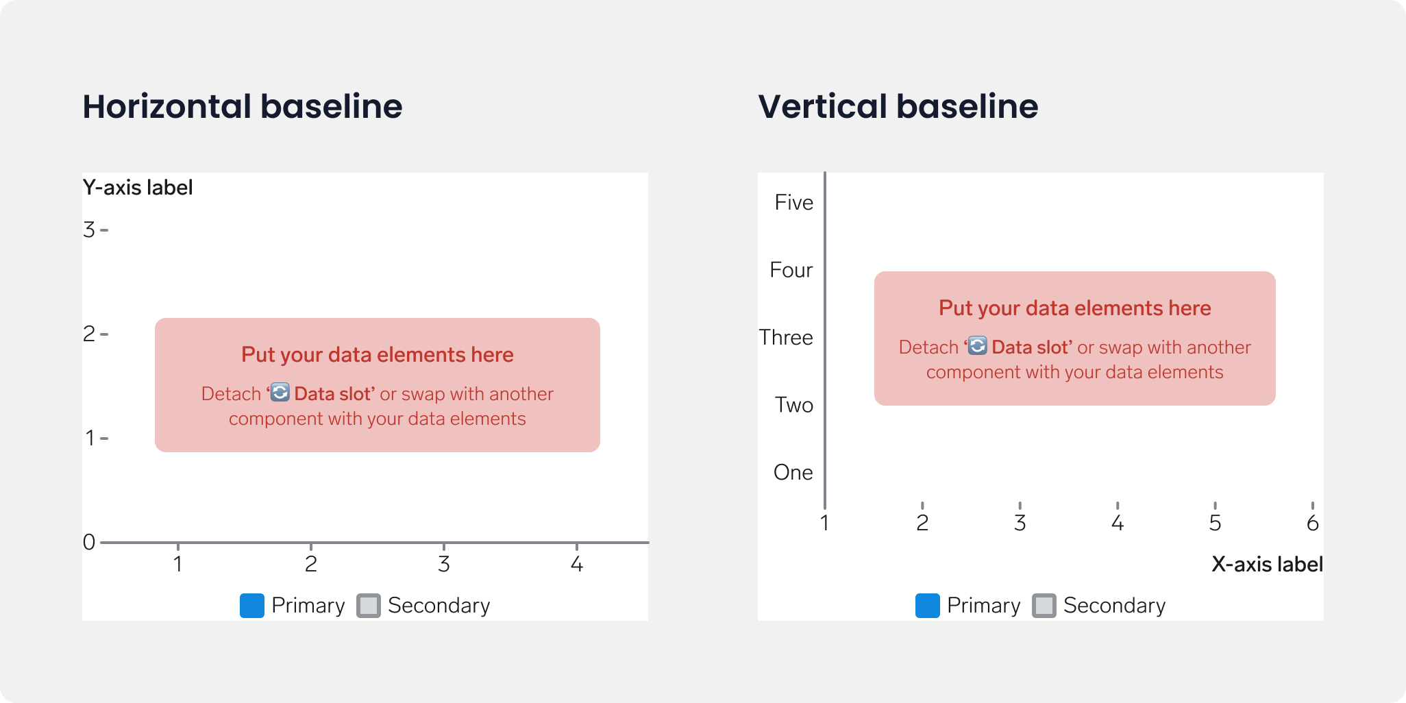
You don't have to use this component when building a chart, but it makes your life easier as you get a lot for free.
Adjust properties without detaching
When you use the Chart elements component or any of the sub-components you can change properties of the components without detaching the mother component. You will need to drill down to individual parts of the chart to find these options.
For example, you can change the text in the labels, and adjust the padding on the Ticks & Labels component like so:
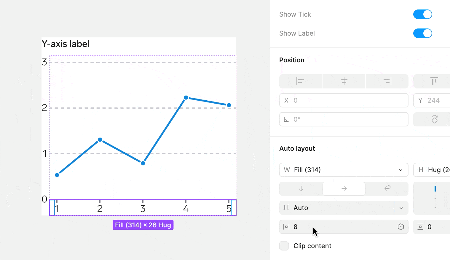
- Select the
X Ticks & labelsframe - Adjust the
Horizontal padding' value underAuto layout` in the right hand panel in Figma.
Components in code
There is currently no WARP component library for data visualization. For web, the JavaScript library you use typically takes care of all the parts of a visualization.
Which JavaScript library should you use for charts?
There are many JavaScript libraries available, such as HighCharts, D3, visx, Recharts and Apexcharts.
Product teams in Vend use a variety of charting libraries, and we have not decided on a recommended library. This is not straightforward, as different teams might have unique chart requirements.
Make sure to check if the library allows you to follow the Success criteria, for example for screen reader accessibility.
If you are starting from scratch it might be a good idea to reach out to other teams that have already built graphs in Vend.