Interaction with Dataviz
It can be valuable for a user to filter or sort the data, or get more details on demand. These guidelines deal primarily with getting more information about each data point in a graph.
Interactive features should be accessible for all users – including keyboard navigation and screen reader. In addition, consider making the information available in a table view.
On this page:
Interaction states and pseudo-classes
Guidelines for interaction states and pseudo-classes for graphs and charts.
Hover and tap
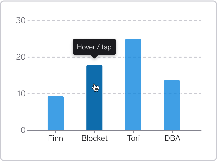
For graphs, users typically expect the same interactive behavior for hover (using a pointing device) and tap (on a touch device). When hovering or tapping, they expect to get details about the data point.
Optionally, keep the tooltip open until another tooltip opens, or the pointing device has left the graph. This might be particularly useful if the data point target sizes are small.
Styling for hover and tap
Use highlight color for the data mark, and provide information about the data mark in a tooltip. You can also dim other data marks.
For lines, consider using a thicker line on hover. For points, consider scaling up the points.
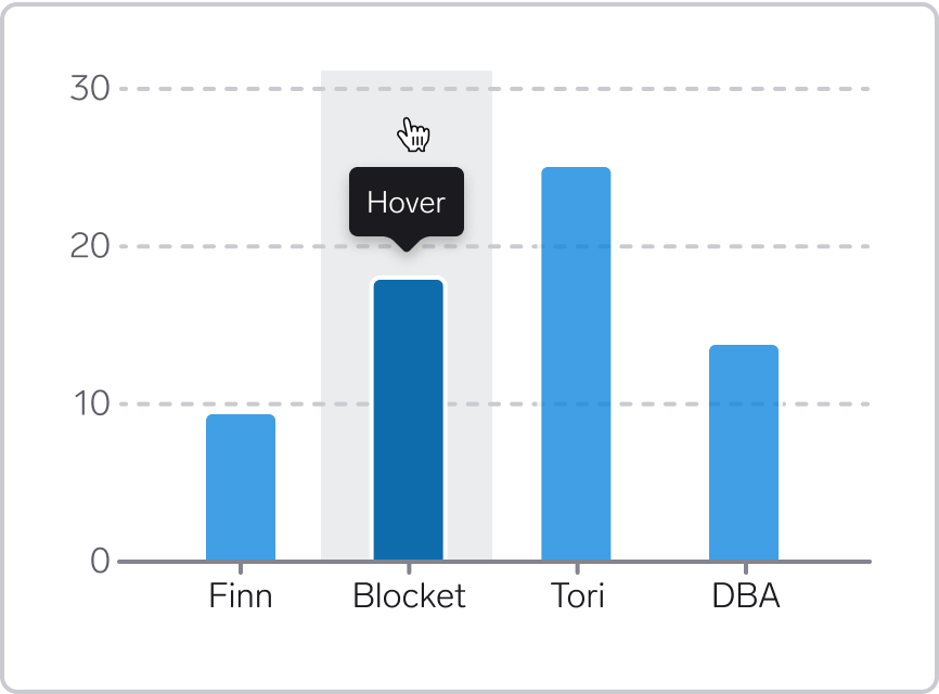
Target size for hover and tap
The interactive area for hover and tap (the 'target') can be larger than the data element itself. The target size should ideally be at least 44 by 44 CSS pixels. We should strive for this, even though it might not always be possible, for example if multiple points are close to one another.
Bars:
- Make the full height/width behind the bar hoverable. In that way, it becomes easier to move the cursor across the graph and get additional information about each bar, including bars that have low data values
- Arrange the target areas side by side with no gaps between them, to avoid flickering when moving the cursor along the graph
- Optionally, add a subtle background that fills the target area. We don't have a specific token for this for now, but for now can for example use
Background/Secondary-Subtlewith 50% opacity. See illustration below.
Lines and points:
- Add a larger target area around the data elements
- Be aware that it might be hard to reach certain lines or points if they are overlapping or close to one another. If the foremost element have too large touch/hover targets, it might be impossible for the user to reach the underlying elements.
Focus (keyboard navigation)
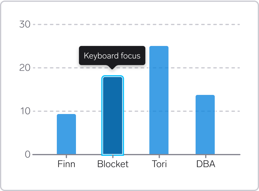
All the information that can be reached using a mouse pointer should also be possible to reach using a keyboard.
Interaction pattern
A typical pattern for navigating graphs using a keyboard:
- As the user reaches the graph using the
tabkey, the first data mark is in focus - The user can then use the
arrow keysto navigate between the data marks - When the user hits
tabagain, the focus goes to the next interactive element outside the graph.
For working examples of how this works, check out the graphs on uutilsynet.no. For more information on keyboard navigation, check out the success criteria for keyboard navigation.
Styling for 'Focus'
For bars, areas and points, add a focus outline around the data mark. There should be some space between the bar/point and the focus border. In addition, use highlight color for the data mark, and provide information in a tooltip. You can also dim other data marks.
For lines, adding a focus border for the whole line will become messy. In stead, add focus border around the point on the line that us currently in focus, and dim any other lines in the graph.
Components and tokens
Information about which components and tokens to use for interactive graphs and charts.
Tooltip
For tooltip, use the WARP Tooltip component.
Highlight color
Use the highlight color on hover, touch/tap and keyboard focus.
All dataviz colors (except the chart colors) have a highlight version. These tokens have a name ending with -highlight.
See this Figma prototype for an interactive preview of the highlight colors.
For implementation examples, see Tokens & CSS > Introduction.
Dim other elements
In addition to using the highlight color, consider dimming the other elements that are not highlighted. A good starting point is 80% opacity when using hover and keyboard focus.
In bar charts, place hoverable areas immediately next to each other with no space in-between, to avoid a 'flickering effect' when moving the cursor across the bars. If you are not able to do so, you should probably not dim the other bars.
For dimming colors using utility classes, ses opacity modifier.
Keyboard focus
When using keyboard navigation, use a focus border around the active data element. There is no dedicated focus color for dataviz – use the regular WARP tokens:
s-border-focus or border-color: var(--w-s-color-border-focus).
See CSS Border Color.
Legend
If the visualization includes a legend, consider making the legend interactive so that the user can turn a data series or category on or off. This can make the information in the chart more accessible, for example for people with color deficiencies.