Figma Library
How to connect and use the Figma library. Mostly for designers.
How to connect and use the Figma library. Mostly for designers.
Overview of Figma components. Mostly for designers.
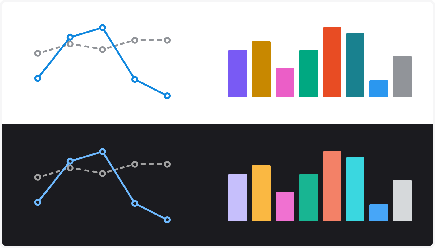
Guidelines for using the dataviz colors. Mostly for designers.
Guidelines for implementing colors in code using tokens and CSS. Mostly for developers.
Guidelines for interacting with dataviz. For designers and developers.
Success criteria for creating accessible and useful data visualizations. For designers and developers.
On this page you will find a general introduction to working with data visualization – commonly referred to as ✨ dataviz ✨.
On this page:
WARP offers a comprehensive color palette for data visualization, available both in Figma and code. See Color usage for guidelines, and Tokens & CSS for implementation in code.
There is no dedicated dataviz library in Vend, as different teams currently use a variety of libraries. However, there are some components available in Figma. See Components.
These guidelines and resources primarily apply to graphs and charts, not maps.
When you create visualizations you want to:
These are high level principles we should strive for. In the section Success criteria there are more specific guidelines.
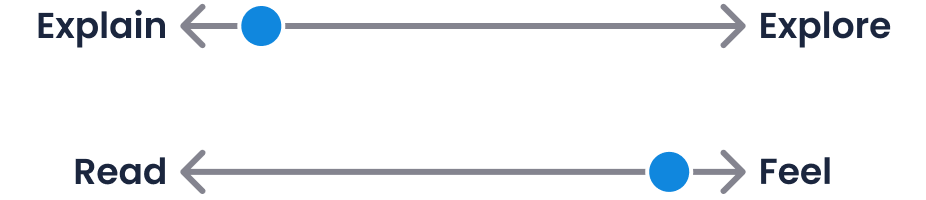
Before you make a visualization it can be useful to define the goal of the visualization. One way of doing so is to answer two core questions:
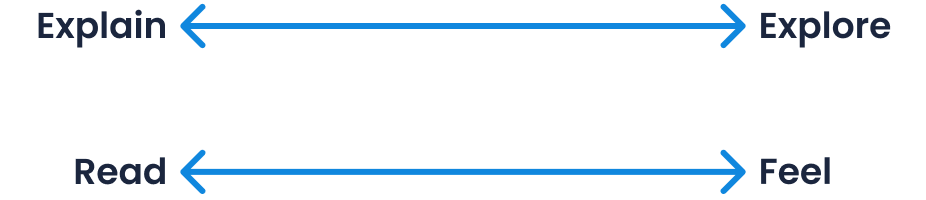
In order to find a good chart it is useful to figure out what you want to show about the data. In other words, what function the chart should serve.
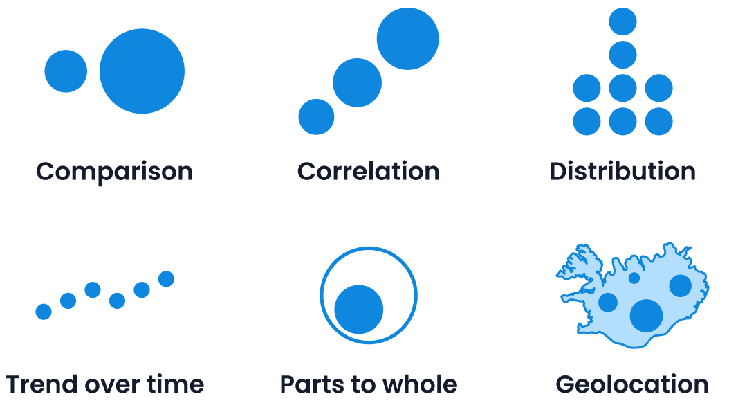
The most common functions are:
TIP
For a full overview of different chart types you can use for different functions, have a look at the DataViz Project.
A good visualization communicates insight in a clear and engaging way without the need of somebody to explain the insight to you. Don’t be afraid to add some text to make the visualization clear. The best visualizations enable users to take action based on the insights they get from the visualization.
Consider this example:
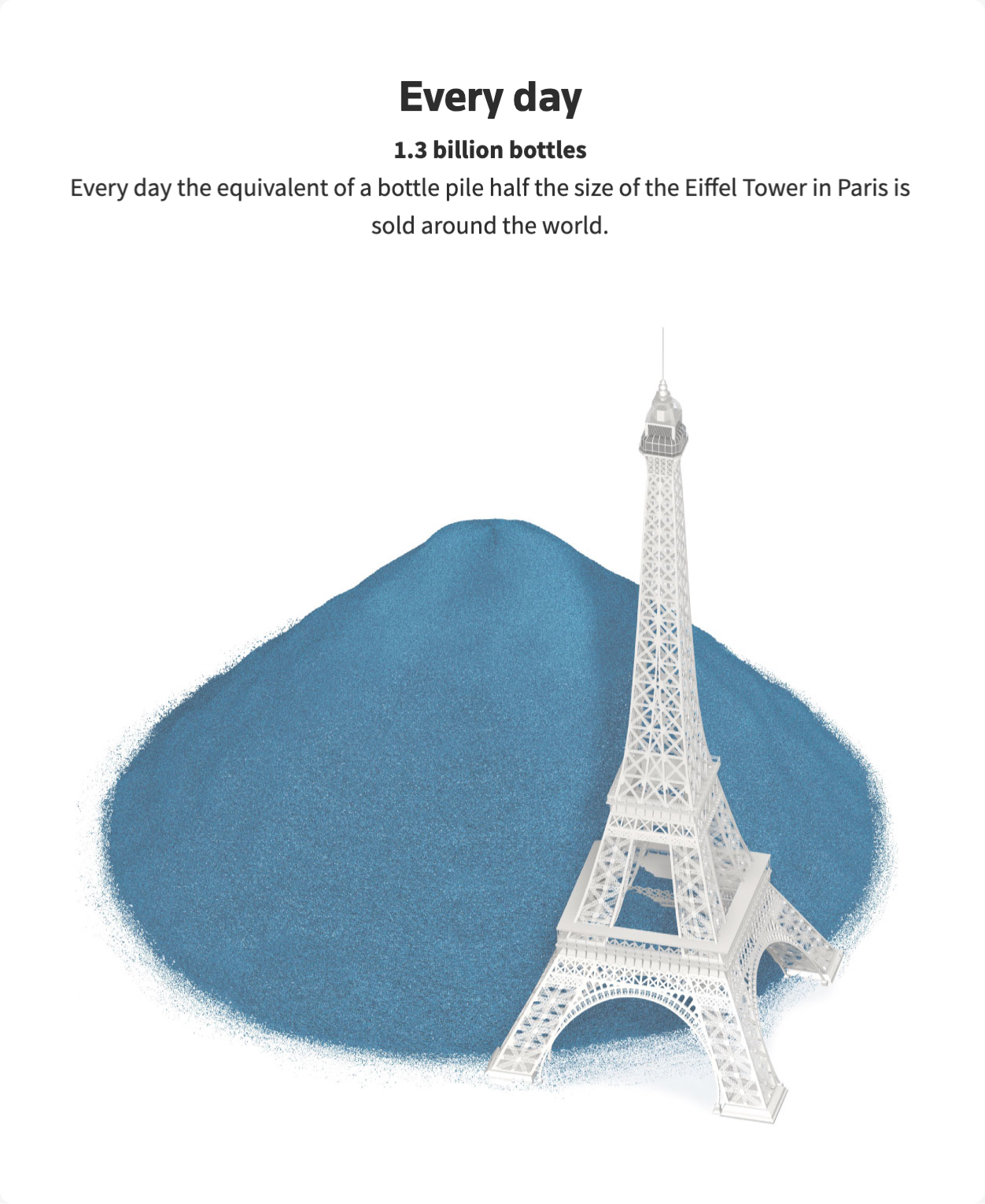
Image source: REUTERS
The visualization above puts a number (that otherwise would be very abstract) into a context that makes it possible to understand. In addition, the visual form itself grabs your attention and makes the insight memorable. Text is used to explain the visuals.
It seems that the goal of this visualization is to explain a specific message, rather than make you explore a dataset. In addition, the goal seems to be to make you feel something and get an overall understanding rather than enable you to read off exact values.
Don’t hesitate to reach out to the design system team on Slack (#warp-design-system) if you have any feedback or questions.