Tokens
Design tokens serve as the definitive source for naming and storing visual properties, such as such as colours, typography, spacing, and other style attributes.
By defining design tokens, we establish a common language that can be easily translated and applied across different brands, ensuring a cohesive and harmonious user experience.
Supported brands
WARP is supporting multiple Vend brands, we’re currently working on adding more brands and support for each brand.
| Brand | Figma | Web | iOS | Android |
|---|---|---|---|---|
| FINN | Live ✅ | Live ✅ | Live ✅ | Live ✅ |
| Tori | Live ✅ | Live ✅ | Live ✅ | Live ✅ |
| DBA | Live ✅ | Live ✅ | Live ✅ | Live ✅ |
| Blocket | Live ✅ | Live ✅ | Live ✅ | Live ✅ |
| Bilbasen | TBA ⌛ | TBA ⌛ | TBA ⌛ | TBA ⌛ |
| Oikotie | TBA ⌛ | TBA ⌛ | TBA ⌛ | TBA ⌛ |
| Neutral | Live ✅ | Live ✅ | Live ✅ | Live ✅ |
| Vend | Live ✅ | Live ✅ | Live ✅ | Live ✅ |
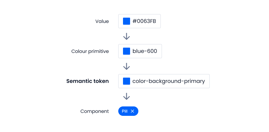
Semantic colour tokens
Semantic tokens are not connected to any specific component and can be used to create custom designs that are still multi-brand friendly.
If you are building a component that doesn’t exist in WARP you can still use semantic tokens and get support for dark mode and all other Vend brands for free.
This is a visualization of all the semantic colour tokens existing in WARP, use it as a reference to see what’s available and the difference between brands.