Layout
Object Fit
Utilities for controlling how a replaced element's content should be resized.
Quick reference
| Class | Description |
|---|---|
object-contain | object-fit: contain |
object-cover | object-fit: cover |
object-fill | object-fit: fill |
object-none | object-fit: none |
object-scale-down | object-fit: scale-down |
Basic usage
Resizing to cover a container
Resize an element’s content to cover its container using .object-cover.
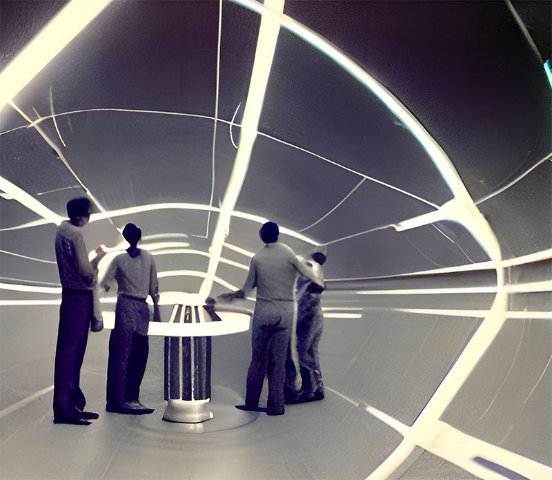
<div class="aspect-2/1 ...">
  <img class="object-cover ..." src="..." alt="..." />
</div>
Containing an element
Resize an element’s content to stay contained within its container using .object-contain.

<div class="aspect-2/1 ...">
  <img class="object-contain ..." src="..." alt="..." />
</div>
Stretching to fit a container
Stretch an element’s content to fit its container using .object-fill.

<div class="aspect-2/1 ...">
  <img class="object-stretch ..." src="..." alt="..." />
</div>
Scaling down if too large
Display an element’s content at its original size but scale it down to fit its container if necessary using .object-scale-down.

<div class="aspect-2/1 ...">
  <img class="object-scale-down ..." src="..." alt="..." />
</div>
Using an element's original size
Display an element’s content at its original size ignoring the container size using .object-none.

<div class="aspect-2/1 ...">
  <img class="object-none ..." src="..." alt="..." />
</div>
Applying conditionally
Breakpoints and media queries
You can also use variant modifiers to target media queries like responsive breakpoints, dark mode, prefers-reduced-motion, and more. For example, use md:object-scale-down to apply the object-scale-down utility at only medium screen sizes and above.
<img class="object-contain md:object-scale-down">